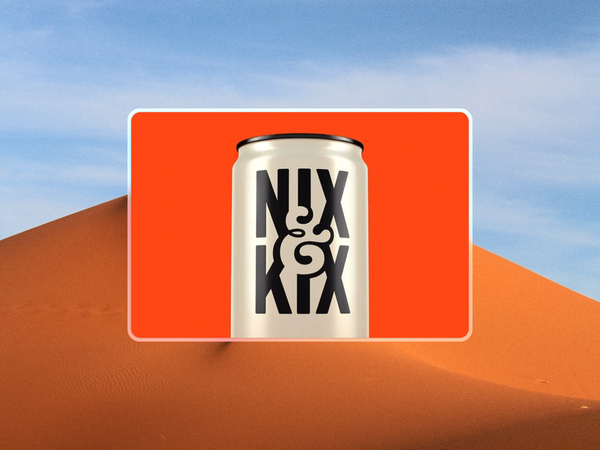
This can isn’t trying to sell you a drink.
There’s no flavor listed. No ingredient claims. No shouty health benefits.
Just a bold, clean logo sitting confidently on a cream background. And that’s exactly what makes this design stand out.
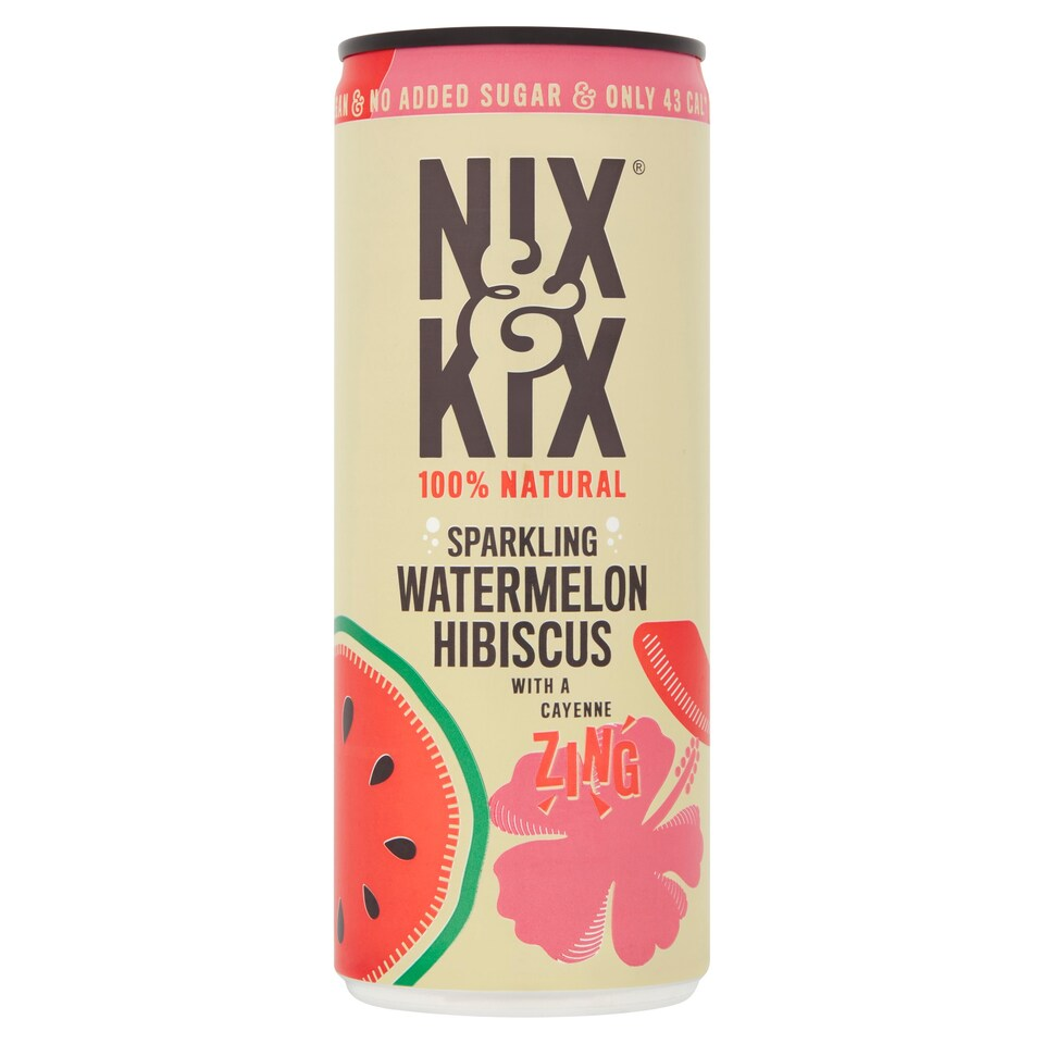
Nix & Kix has a full range of drinks on the market—sparkling fruit blends with a little chili kick.
Their shelf-ready cans do what you’d expect: show off the flavor, list what’s inside, and highlight the benefits. But this can? It’s not that. It’s something different.
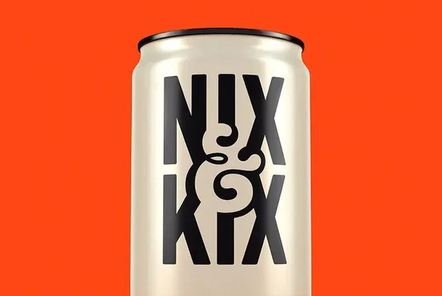
This looks like a brand-first moment. A sample, maybe. A concept. The kind of design you make to test how strong your branding is when it stands on its own. And here, it really does.
The tall, black letterforms have weight. The ampersand ties it all together and adds a bit of flair without overcomplicating things. The cream backdrop gives it space to breathe. It’s confident, but not loud.
Minimal, but not boring.
This is the kind of design that makes you pause, even if you’re not sure what it’s for.
That’s good branding. It doesn’t need to sell the product—it sells the name.
It also proves a point: if your logo holds up this well on a blank canvas, you’re doing something right.
So what can we learn from this?
- Don’t overcrowd your design. Restraint is powerful.
- Custom type goes a long way. You don’t need much else when the type is doing the heavy lifting.
- Color contrast matters. Cream on black is subtle but effective—especially on a shelf full of bright cans.
This design reminds us that minimal doesn’t mean boring. When done right, it’s confident, memorable, and just a bit cooler than the rest.