
Nationwide Rebranding: A Controversial Transformation
Nationwide's recent rebrand sparks debate as it shifts from a community-focused approach to a 'challenger bank' look

In case you haven't heard, Nationwide has had a bit of a rebrand.
If you have heard, you'll likely know that it hasn't gone down too well. Perhaps that's unfair, as there are some folks who do like the branding refresh, but a minority.
This minority applaud the new 'challenger bank' look, suggesting it brings Nationwide in line with Monzo, Revolut or Starling. It's uncertain whether Nationwide intended this shift, but it appears they are embracing a 'challenger bank' style to attract younger, more modern customers.

But mostly, from what I've seen on LinkedIn, people are clamouring over one another to wax lyrical about why this rebrand is awful, terrible, not very good. After reading multiple opinions from all the cool online design hangouts, I have to agree, that this is a rebrand miss-step.
Now, I see another financial service devoid of distinctiveness, blending into a sea of uniform sans-serif flatness that might suit other brands but not Nationwide.
As someone who has been a Nationwide customer for nearly 15 years, I wanted to explore and understand the reasoning behind this transformation. Seek online, and it's hard to find reasoning outside of PR fluff, with the occasional theory here and there.
"The updated logo is still “distinctly Nationwide” but adopts a more dynamic look to be a “modern challenger to traditional banks”. The Nationwide house icon has been simplified to geometric shapes, and NCA has created a custom version of Founders Grotesk." - A Nationwide spokesperson
But ultimately I mostly take issue with this rebrand. Mostly because what was once distinctiveness is now indistinguishable. For the reason folks like the new 'challenger bank' look, I think this happens to be the rebrand's greatest downfall.
For a building society looking to differentiate itself through values and by extension, its brand, they've done a hell of a job making their offering look exactly like every other offering that exists.
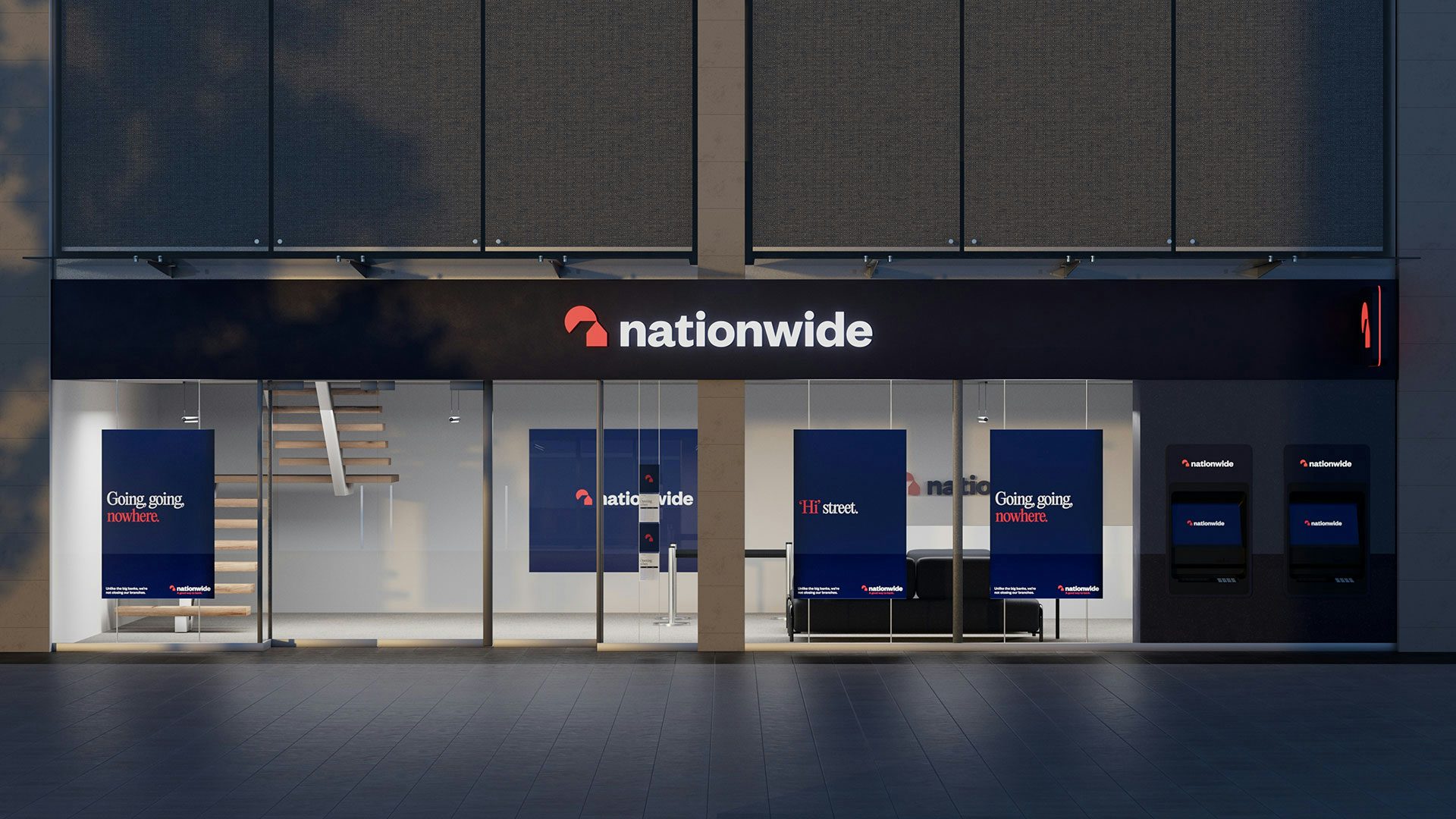
Now, I see another financial service devoid of distinctiveness, blending into a sea of uniform sans-serif flatness that might suit other brands but not Nationwide. Especially if their aim is to stand out from the typical bank experience.
The full extent of the issue dawned on me, as I opened the finance section on my phone, to be greeted with the updated app icon. My belief in keeping brands relevant is unwavering, but it appears that Nationwide might have sacrificed what made them truly exceptional – their community-centric focus.
This was their key differentiator, as demonstrated from the below:
“I like the ability to comment on things that Nationwide are thinking about doing, and the possibility that my contribution will help to improve things for members. It’s a chance to provide feedback on developments at Nationwide, helping to improve the building society in the way members want”. - Nationwide member
The community is at the heart of what Nationwide do, or at the very least, that's what they say is so incredibly important to them. Now though, I'm not so sure. It seems they enthusiastically embraced the 'challenger bank' aesthetic when in reality, they should have remained loyal to their identity as the people's bank.
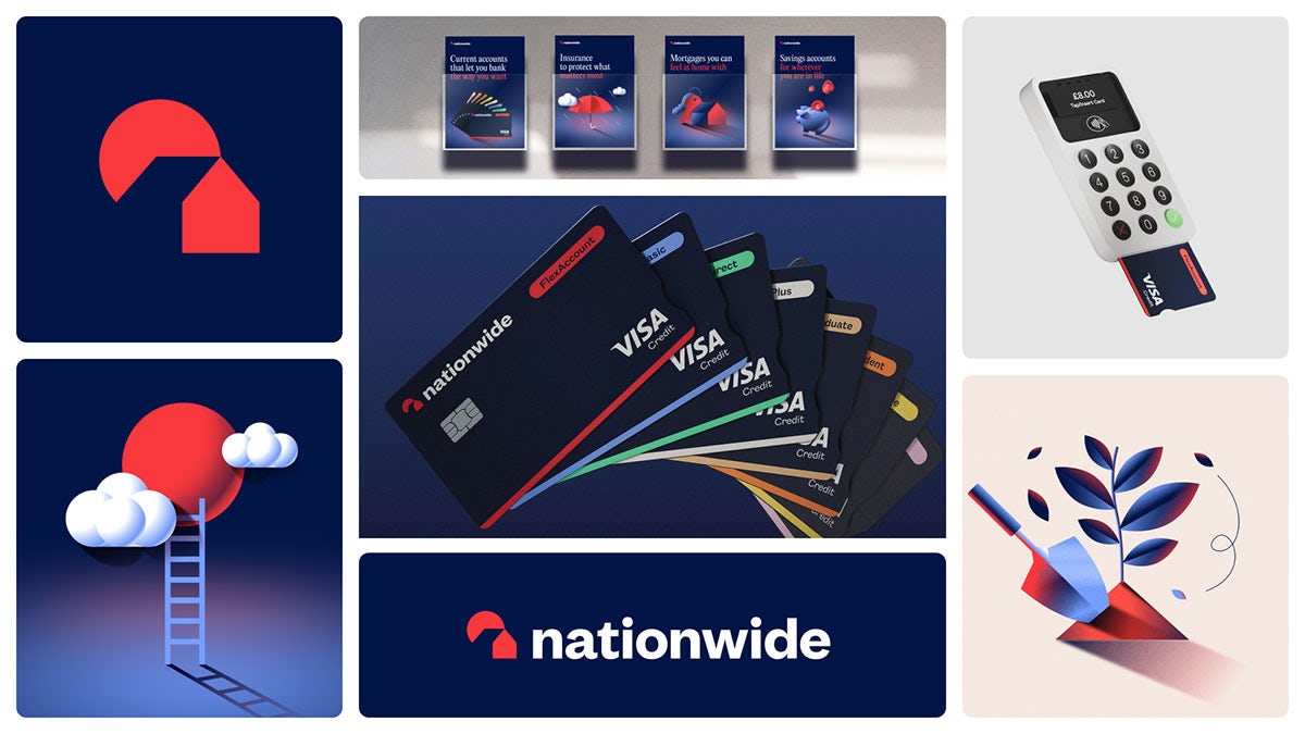
They've removed human photography from their brand and replaced it with 'millennial clipart', a move that makes them resemble Monzo, and much less the community they reportedly aim to serve.
But here's the kicker: The new look bears a striking resemblance to Natwest, a bank with a somewhat similar name. When undertaking any rebrand or brand refresh, one of the fundamental principles is to ensure that your identity remains visually distinct from your competitors.
It's a missed opportunity. Awful, terrible, not very good
I could delve deeper into this, but the key takeaway here is that while considering design trends is important in any rebrand, it's just one piece of the puzzle. The more critical factors in determining the right creative direction should be rooted in a profound understanding of your customers, your competitive landscape, and what truly defines your company (or what we in the business refer to as the 3 Cs).
But the horse has bolted, and whether Nationwide likes it or not, they're in the midst of a significant transformation.


Comments ()