Note from the author: This is something of a hobby for me, and mostly done for fun. I appreciate that it's extremely easy to dismantle a UI from nearly 30 years ago. When I offer improvements, I'm aware that game design has moved on significantly from the 90s. Enjoy!
Gran Turismo opens with an FMV intro—pre-rendered, full of glossy cars, dramatic camera angles, and orchestral swells. It sets the emotional tone. But the moment it ends, that energy is stripped back.
The title screen loads, and you're dropped into something much more tempered, more controlled.
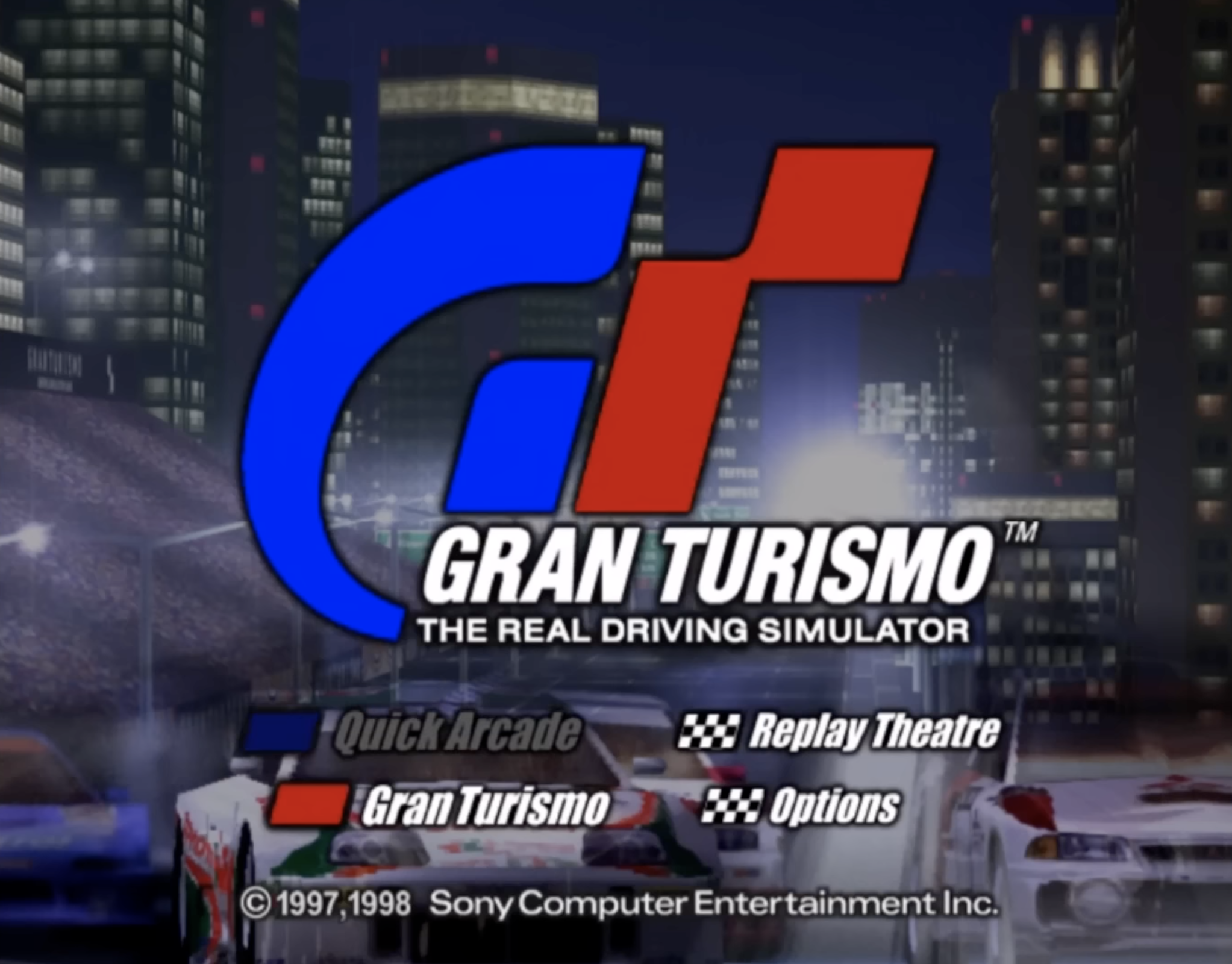
The UI is intentionally minimal. A huge GT logo dominates the screen, styled in bold red and blue with sharp, clean lines. It’s branding, sure, but it also acts as a visual anchor. There’s nothing else on screen competing for attention.
You know where you are.
Menu options are bottom-aligned, not centered, which creates a subtle power dynamic. The logo owns the screen, the player navigates below it. It's a hierarchy that mirrors the game’s structure: you’re not the star, the cars are.
The choices, Quick Arcade, Gran Turismo, Replay Theatre, and Options, are clear, jargon-free, and immediately actionable. The UI avoids nesting, which speeds up first-time use.
Each option is paired with a checkered flag icon, reinforcing the racing theme without going full novelty. Importantly, everything sits on a black background. No gradients. No glow effects. Just a clean frame that holds the focus.
Typography plays a huge role in the UX.
The all-caps sans serif text uses wide kerning, optimized for readability on low-res CRTs. It's not elegant, but it’s functional. It holds up across screens, modes, and languages.
The menu might have benefited from ambient motion or soft transitions. Even slight responsiveness to input would’ve helped bridge the gap between the energy of the intro and the quiet UI.
Then there’s the tagline: The Real Driving Simulator. It’s positioned under the game’s name, almost as a mission statement. The phrasing is deliberate. It distances the game from arcade-style racers of the time.
And that’s key to the entire interface design—it avoids excess. No spinning menus. No 3D fly-throughs. The UI is quiet because the game wants to be taken seriously.
Finally, the background. A blurred cityscape with streaks of light and hints of race cars. It’s not decorative. It’s mood-setting. It introduces motion, speed, and modernity without stealing focus from the menu.
You’re in a driving world. The UI doesn’t scream it—it just quietly gets you there.
A Map That Hides Its Depth
Once inside Simulation Mode, players land on what looks like a stylized city map, but this isn’t just aesthetic. It’s a UI built around spatial metaphors. Rather than relying on dropdowns or rigid menus, the game arranges core functions and manufacturers around a city grid.
Effectively, you’re not just navigating options, you’re moving through a world. At least that's the intention.
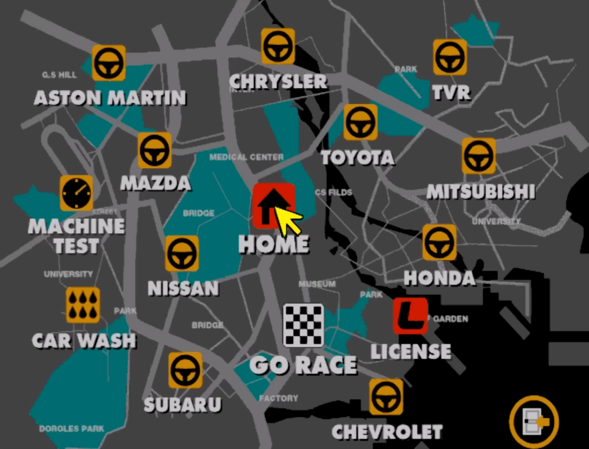
Each element sits in its own “district,” mimicking a real-world layout.
Dealerships are clustered like commercial zones. Your garage is labeled HOME at the center, and it feels like an anchor point. The metaphor works well: it orients players and makes repeated actions, like visiting the same few dealerships, feel routine, even familiar.
The use of color is deliberate.
Bright orange icons mark interactive elements like manufacturers or systems (car wash, machine test). These icons all sit against a grey and teal background. The contrast creates instant visual separation between interactive and passive space, keeping the screen readable even on early TVs.
Typography stays consistent with the title screen—all caps, wide spacing, white text with slight drop shadows for clarity. Text sits flush with icons, not over them. Everything reads fast.
This also reinforces one of the key UX philosophies of Gran Turismo: it doesn't hold your hand, but it doesn’t punish you for curiosity either. If you want to explore tuning options, licenses, tests, or just browse cars, you can.
The map supports both shallow and deep interaction.
The decision to avoid traditional menus and instead offer a semi-diegetic map-based UI wasn’t just stylistic. It made the experience feel persistent. You weren’t just choosing options. You were visiting locations. It gave structure to what could’ve been a flat list of features.
I’d push for a hybrid UI: keep the map for immersion, but add a toggle or overlay for fast access—something like a quick-action menu or radial shortcut. It respects the metaphor but puts utility first.
UX-wise, it made returning to Simulation Mode feel like returning to a familiar space. Over time, you remembered where things were, not because of labels, but because of the layout. That’s a form of muscle memory that most games weren’t built for in 1997.
Minimalism That Feels Mechanical
Inside each manufacturer’s showroom, Gran Turismo moves from abstract map to machine-shop precision.
The dealership UI sticks to strict visual consistency. Black background, yellow ringed buttons, and a left-aligned vertical nav bar reused across menus. These design choices aren’t glamorous, but they create a strong sense of continuity.
You're not starting over on each screen, you're drilling downwards.
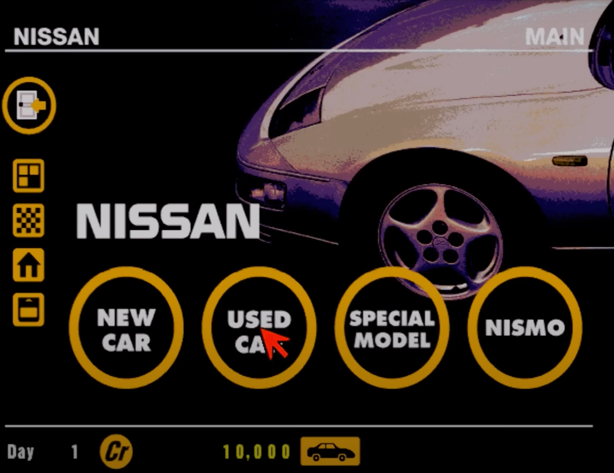
The main interaction zones—New Car, Used Car, Special Model, NISMO—sit in large, circular buttons at the bottom. The icons are bold, touch-friendly in their scale (even though this was for a D-pad), and separated clearly.
The hierarchy is obvious. The car is the star, but your entry points are lined up with mechanical precision. There’s no ambiguity in what each option does.
The sidebar repeats icons from the Simulation Mode, keeping location switching fast and mental models intact. This reuse reduces friction. You never have to relearn the interface. If anything, it gets out of your way the more time you spend with it.
The entire presentation is almost sterile, boring even. But it reinforces the idea that you’re making mechanical decisions.
Drill into Special Models and the vibe stays cold, controlled. The NISMO GT-R LM takes center stage—rendered against a black void, free from background clutter. That emptiness serves a purpose.
It forces your eye onto the car and the stats.
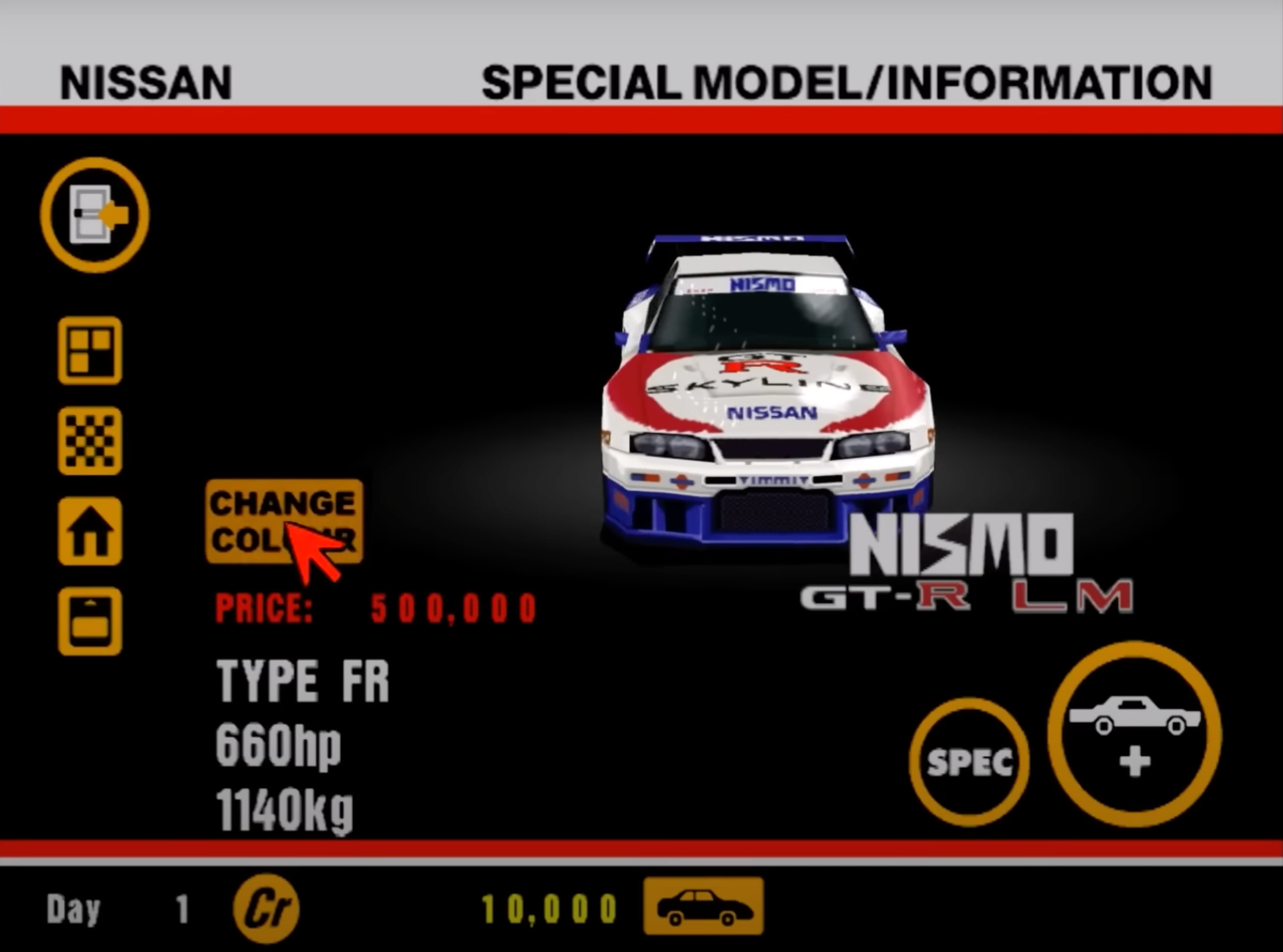
On the left: a big yellow “CHANGE COLOR” button. On the right: two more large buttons, one for specs, one to purchase. Everything in this screen is big, legible, spaced out. It’s not crowded because the decision here matters—it’s a 500,000 credit car.
The UI knows this and makes sure you see all the data before clicking anything.
The red pricing and horsepower values grab attention immediately. The choice of red here isn’t aesthetic, it’s urgency. You're spending half a million credits. The weight of the decision is mirrored in the UI’s tone.
A modern take would introduce comparison states, benefit tags (e.g., “eligible for X championship”), or ownership status. Anything that helps decision-making beyond just raw specs.
UX-wise, it treats the user like someone who already knows what they want, but still needs the full picture. Stats are technical: drivetrain, horsepower, weight. No attempt to oversell or editorialize. It's a UI rooted in simulation logic, not marketing flash.
The end result? You feel like you're evaluating machinery, not unlocking a toy. That mindset shift is exactly what Gran Turismo’s interface is trying to reinforce.
The License Center: UX as Gatekeeper
The License Center screen is stark.
It opens with three chunky options—B-Class, A-Class, and International A-Class—each one locked behind progression. The visual treatment is basic: red, blue, and black tiles with oversized icons. There's no animation, no flourish.
The design speaks clearly: this isn’t optional. It’s procedural. You will get your license before competing.
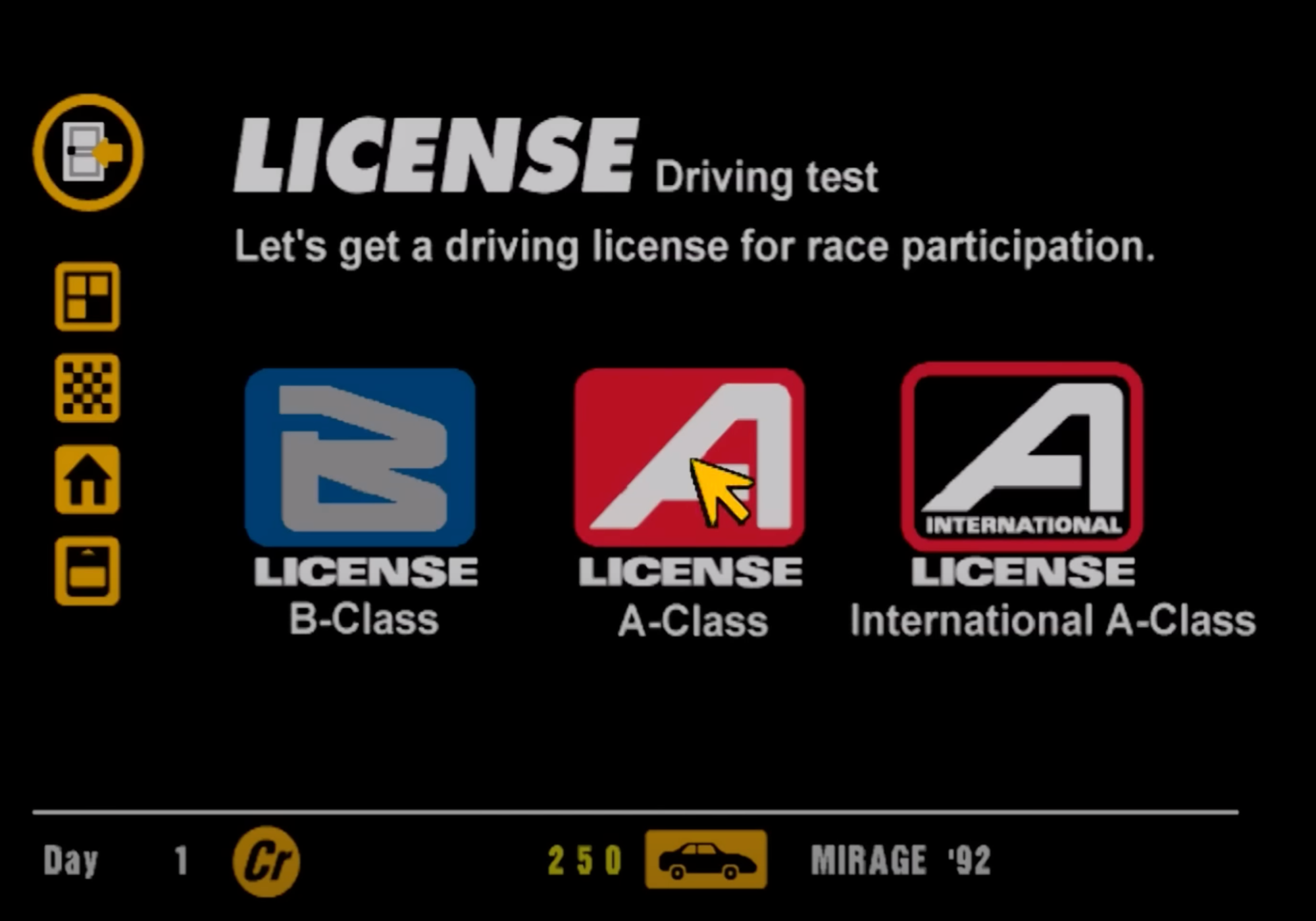
That tone is reinforced by the surrounding UI. Once again, we see the same vertical nav bar on the left, ensuring consistency across game modes. Your credits and car sit along the bottom of the screen, grounding the interface in your current progress. Everything else points forward.
Click into B-Class, and the tone shifts from structured to strict.
The test list is a vertical stack of orange bars—simple rectangles labeled with driving techniques: “Starting and stopping,” “Basics of cornering,” “Multiple cornering.” The layout is as dry as it gets.
Contextual tooltips or ghost data (like “Last attempt: 0:47.90”) would’ve gone a long way. Even letting players view replays from the menu would’ve turned this from a brick wall into a learning loop.
There’s no visual preview of the test, no contextual imagery. Just a list. It’s intentionally bare because the only thing that matters is execution.
Each row holds three trophy slots—bronze, silver, gold—acting as both feedback and incentive. There’s no dialogue box guiding you. No tutorial overlay. Just the prompt and your performance. This is classic Gran Turismo UX: the game assumes you’ll learn by doing.
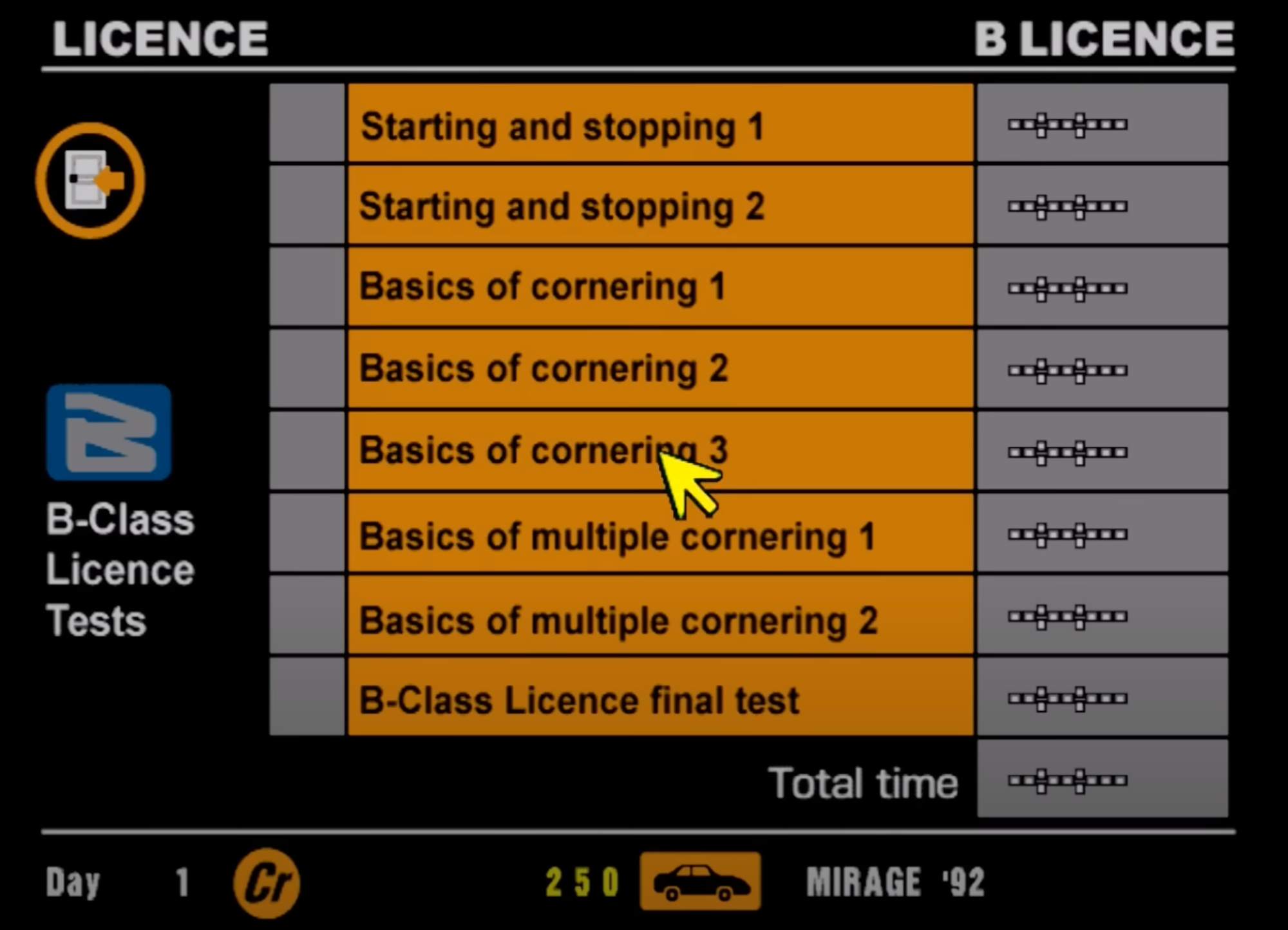
And it works. Because the friction is UI-backed. There’s no fluff between tests. Fast resets, clear rewards, zero ceremony. The UI teaches discipline by offering no shortcuts and no distractions. It’s not designed to entertain—it’s designed to shape behavior.
From a user experience perspective, the License Center is a brilliant use of interface as pedagogy. The design forces repetition. It celebrates precision. And it never once pretends you’re here for fun.
You’re here to earn your right to compete.