Some games don’t just borrow from the past, they rebuild it from wireframe and ink.
That’s what designer Brice Laville Saint-Martin pulled off with BallisticNG, first released in 2018. It’s a modern anti-grav racer that channels WipEout’s spirit but carves out its own identity.
At first glance, it looks like fan art. But spend more than a second, and you realize it feels more like world-building than a simple nostalgia piece.
Vectors that speak
Brice’s posters don’t decorate the game. They extend it into the real world.
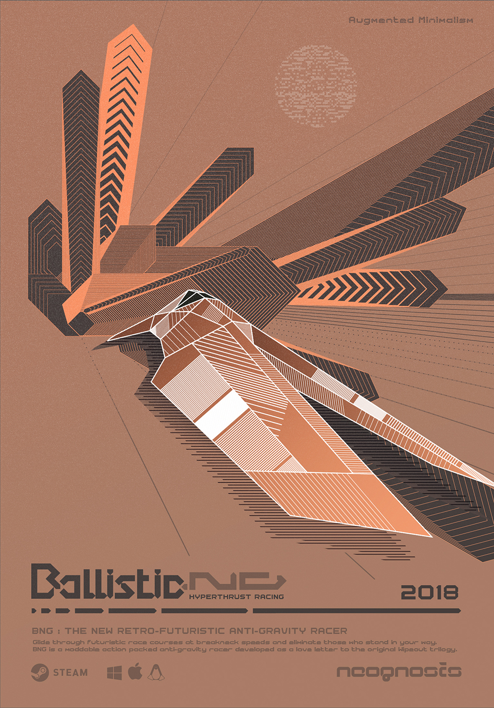
Every line, ship, and color field carries forward the same brutalist, techno-utopian fiction that fuels the gameplay. Ships barrel through flat geometry like propaganda rockets. The typography doesn’t whisper, it marches with purpose, bold and unrelenting.
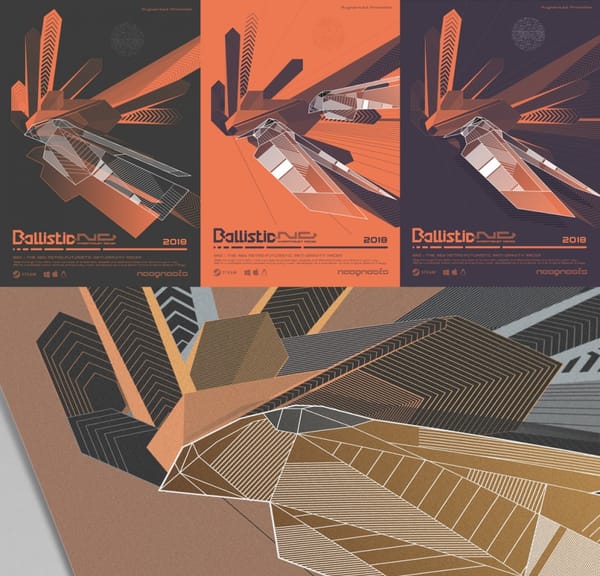
The Gold/Silver/Bronze limited editions were printed using three-color silkscreen and metal inks — not just for aesthetic punch, but to lock the art into the physical world. They’re heavy in mood and weight.
Each one introduces a ship in its own color set, complete with intricate wireframes and graphic overlays that feel as much like an interface as they do a poster. They feel like collectible blueprints from a future that never was.
Wonderfully tangible.
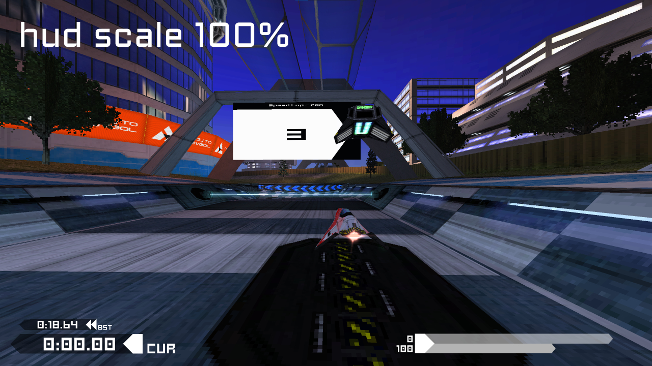
What makes this body of work sing is how little separation there is between poster art and interface. The HUD in-game? It speaks the same visual dialect.
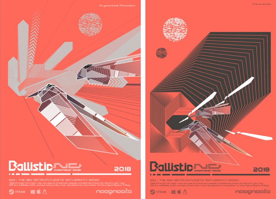
The teaser prints — Augmented Minimalism, Time Extended, SineWaving — each look like a split-second frozen mid-race. They carry motion, tension, and data. Red dominates the palette. Ships cut through space like blades.
And the backdrop? A world rendered in patterns, lines, and symbols.
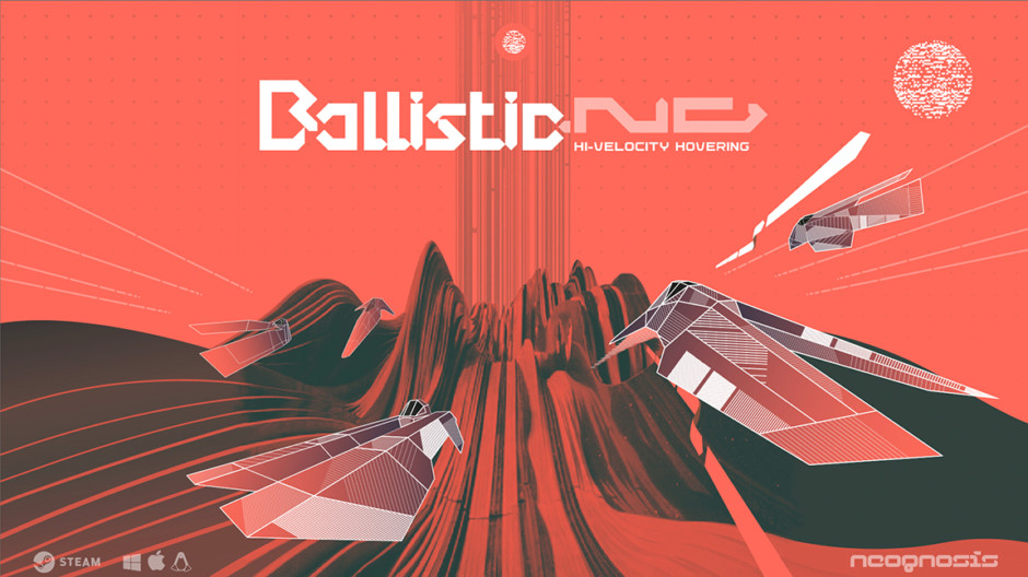
There’s a confidence in this. Dayglo hyperchromatic futurism. No gradients. No cheap texture. Just raw forms and strong choices.
It would be easy to write this off as a love letter to WipEout — and of course, it is. But Brice isn’t mimicking. He’s imagining what the future of that design language could be.
If the PS1-era aesthetic had kept evolving instead of being buried under photorealism, maybe this is what we’d get.
The result is work that feels pulled from another timeline — one where UI was art, posters were code, and every race was a broadcast event.
BallisticNG gives us the game. Brice gives us the mythology.