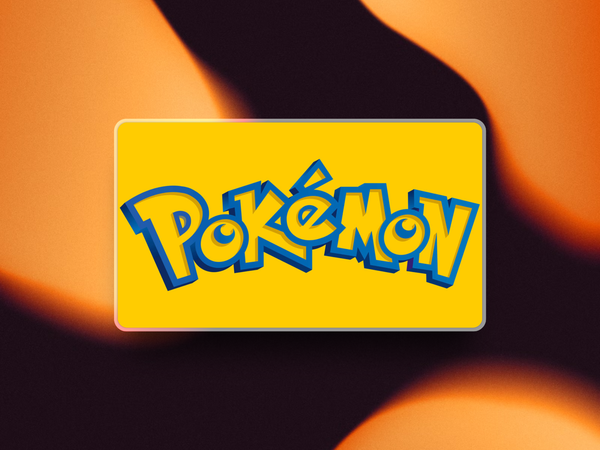
Ever stared at the iconic yellow-and-blue Pokémon logo and wondered who created it? Well, the "mystery" has finally been solved after nearly three decades of silence.
As recently reported by IGN, Chris Maple, a Seattle-based designer who ran a company called Media Design in the late '90s, has finally come forward as the creator of the world-famous Pokémon logo that has adorned everything from video games to lunchboxes since 1998.
A Last-Minute Design That Changed Gaming History
According to the story, Maple was known in the Seattle area for handling emergency design jobs when big companies were in a bind.
His reputation for quick turnarounds and quality work reached Nintendo of America, who called him in when they were struggling to rebrand "Pocket Monsters" to "Pokémon" for Western audiences.
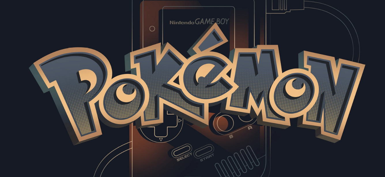
What makes this story particularly fascinating is the time crunch. Maple was given just one month to create what would become one of the most recognizable logos in entertainment history. The design needed to be ready for the E3 1998 unveiling of Pokémon Red and Blue.
"I'd be at a store or something and my daughter would be jumping up and down. She'd go, 'My daddy did that logo,' and a couple of moms would look at me in line and go, 'Oh, so it was you, was it? You're the guy,'" Maple told IGN.
In a bizarre yet charming detail, Maple recalls sitting in Nintendo's lobby staring at a crystal horse head sculpture while waiting for his meeting. While we can't know for sure how much this unusual art piece influenced the final design, it's now an interesting footnote in gaming history.
Why Come Forward Now?
After 27 years of silence, Maple has finally decided to take public credit for his contribution to pop culture. He credits conversations with his son for encouraging him to step forward and claim his place in gaming history.
"For all the people that are interested in the games... wouldn't you want to know what really happened?" Maple explained.
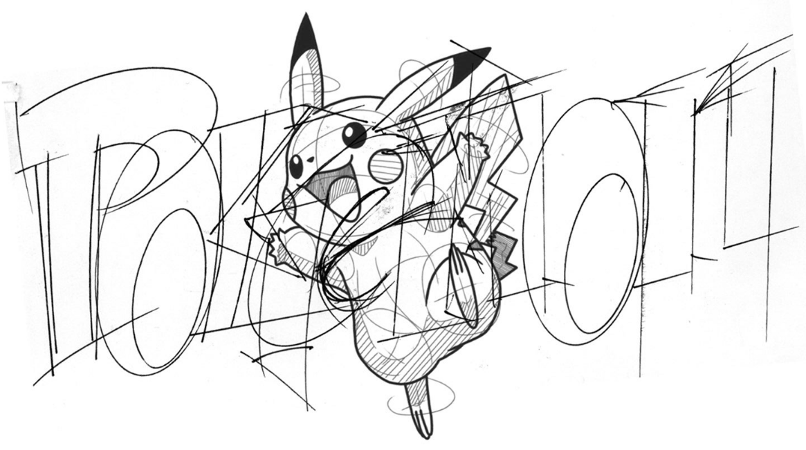
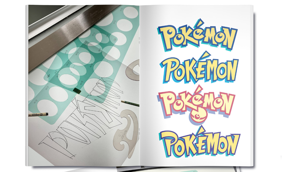
Maple created multiple variations of the logo by hand, working on a light table and trying different letter shapes until he found something that felt right. He didn't have much to go on—just some paperwork, toy figurines, and a brief explanation of what Pokémon was.
When presenting his options to Nintendo executives, including then-Nintendo of America president Minoru Arakawa, the room reportedly fell silent upon seeing what would become the final design. Don James, a former Nintendo executive, broke the silence with: "I believe this is the one."
The yellow and blue color scheme wasn't explicitly requested—Maple tried various color combinations before settling on the now-iconic palette that somehow just "felt right."
Pokémon's 30th Anniversary Hopes
With Pokémon's 30th anniversary approaching next year, Maple expressed hope that The Pokémon Company might reach out to him to help design anniversary branding.
"They're going to dig an artist out of the woodwork and he's going to put '30th' across that logo somewhere and it's not going to be right," Maple noted. "There is an energy and a skeleton in there, and to even add another component, like the word '30th'... Don't just get it done. It's going to be TLC."
Despite his brief involvement with the franchise, Maple's contribution has endured for nearly three decades. The Pokémon logo remains largely unchanged since his original design, a testament to its timeless quality.
Today, Maple occasionally shares his connection to the franchise when teaching children in underprivileged areas, drawing the logo and characters on classroom whiteboards to their delight.
"Some of the experiences you get are just priceless," Maple said. "I'm just happy that it's doing well... I love it, and that's why I work still today."