Top Tools for Crafting Well-Designed Toggle Buttons
A toggle button is only as good as its implementation. There are considerations we need to acknowledge before we enthusiastically include them in our interfaces.

The toggle button is one of the most important user interface controls on the web and in apps today. It’s a control that, if not designed with careful planning, can be a source of friction and confusion for users. In order to provide the best user experience possible, this is obviously something we want to get right.
A toggle button is only as good as its implementation. There are considerations we need to acknowledge before we enthusiastically include them in our interfaces.
As is often the case with many UI components, toggle buttons should be used appropriately. Do we really understand how users will navigate through a particular system, and have we anticipated how they might do that? Can we say with certainty that a toggle button is a good choice over, for example, a checkbox? More on that later.
How toggle buttons are presented and whether or not they are accessible are equally as important. Toggle buttons should be accessible, no excuses.
Furthermore, what tools exist today to allow us to create effective toggle buttons based on these considerations? In this article, let’s explore further what a toggle button is and what tools we can use to our advantage to help us make a toggle button that observes good design practice.
A toggle button for the people. ✊
N.B., a toggle button in interface design can technically have more than two options, as we’ll demonstrate next. It’s also worth mentioning that while most publications refer to these controls as toggle buttons, Apple is more likely to refer to them as segmented controls.
When is the right time to use a toggle button?
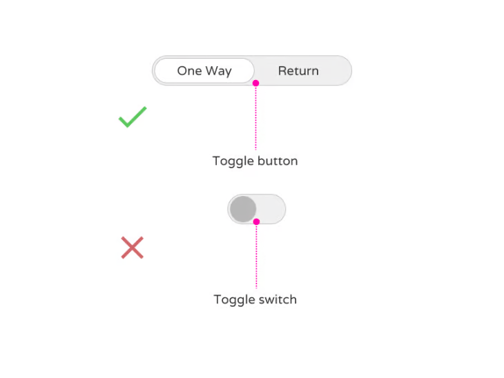
Let’s get this out of the way first: a toggle button is not the same as a toggle switch. If you search for both terms on Google, you’ll likely see a mishmash of both controls shown as folks scramble to make sense of it all.
But it’s actually rather simple: a toggle button can have more than two options, whereas a toggle switch will only ever have two options. Simple, right?
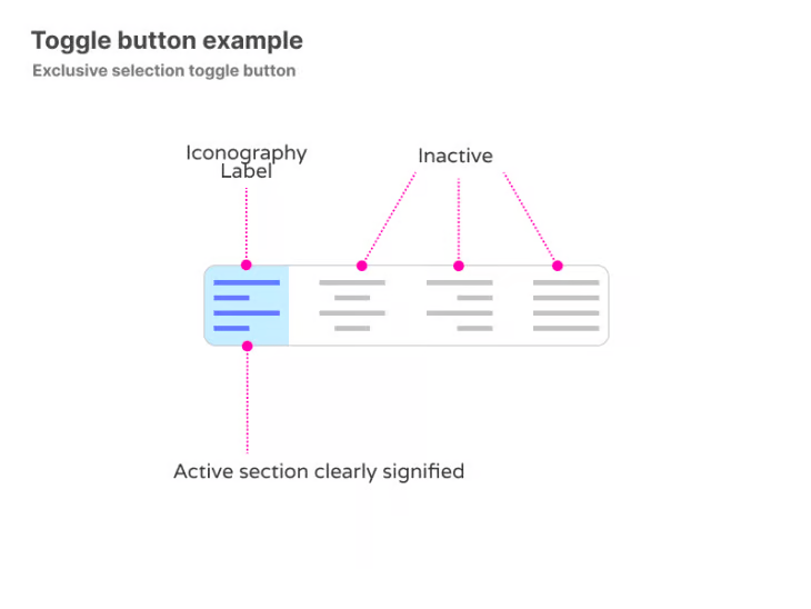
Let’s focus on the toggle button by using an example most of us will be familiar with. As I currently write this article, in Google Docs, I have the option to left align, center align, right align or fully justify text — that’s a toggle button.
Specifically, it’s an exclusive selection toggle button. Exclusive in this case means one; as in, I can only choose one of the four options. Choosing both left and right-aligned text together wouldn’t make sense, right?
Furthermore, all toggle buttons should have a default state, and in our Google Docs example, the default state is left aligned. The system by default has exclusively selected our default state.
Not having a default state would go against well-established design patterns and might cause confusion amongst users if they’re not immediately certain what initial choice has been made by default.
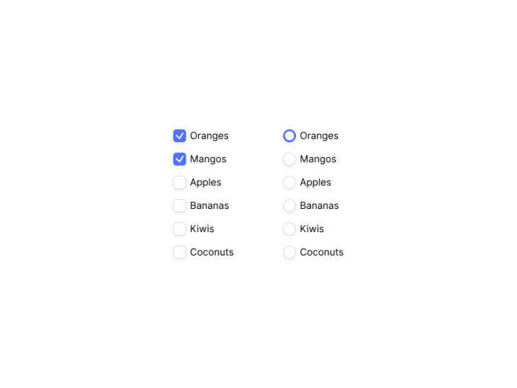
Should you use checkboxes, radio buttons, or toggle buttons?
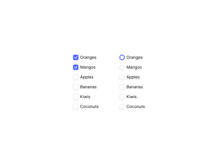
But what about checkboxes or radio buttons, you might be thinking? Well, the visual indication for a checkbox differs from a toggle button. While making a selection within a toggle button implies both selection and instance, a checkmark only indicates selection.
The burden of instance is entirely on the user, meaning they must carry out additional steps to complete their action. A good example of this would be within the context of a typical registration form. A user might select one checkbox, or multiple checkboxes, and then need to press submit to complete their registration.
Checkboxes are ideal for situations which call for multiple selections. Toggle buttons aren’t, because using multiple toggle buttons increases cognitive load, with additional frustration as users need to wait for the system to apply each setting one by one. In this situation, they’d also take up a great deal of space, adding clutter and compounding cognitive load. That results in a terrible user experience. Checkboxes allow the user to select multiple options, and then submit in their own time, allowing the system to deal with multiple requests on submission.
Radio buttons are similar in that they are a selection first and foremost, but not a selection and instance like a toggle button. Again, just like checkboxes, the user is selecting one of many possible actions, which they’ll eventually save later by submitting.
N.B., if you’re considering including toggles in long forms where other types of form fields are present, and users eventually need to click Submit for other changes to take effect, don’t.
What makes a good toggle button?
So we now have a better understanding of when to use a toggle button, but what makes a good toggle button?
One default selection
Let’s use a hypothetical scenario. You want to book an airline ticket, and information is split between a “one-way” ticket and a “return” ticket. In order to switch between the two, the user must select either one-way or return.
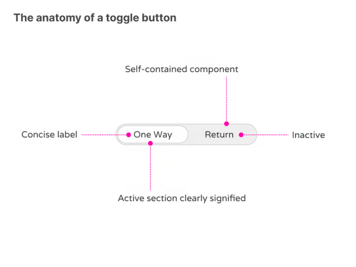
As we’ve stated, toggle buttons should have a default state. When the page loads for our fictitious airline booking system, the toggle button and information associated with “one-way” will load first.
It’s generally up to the design team to decide what option should be the default option, but fundamentally, it’s important to remember that at least one state needs to be the default value and the information associated with that value displayed. It should also be clear which state is selected by default.
Clear visual cues
This is where good visual cues come in. The selected state should be the most immediate, most prominent aspect of the self-contained component. This can be done through bold text, through colour, or through iconography to show an on-state.
The off state can be the inverse of the on state, usually displayed with a lack of colour, with text taking on less weight, and with iconography greyed out. Ideally, using all of these attributes combined makes for obvious differentiation between different states.
An immediate change of state
When a user interacts with either, the state change is immediate. That means the page will automatically update the state and the information associated with that state. This is completely seamless for the user, as they will not need to manually save the changes made.
Clear labels
A toggle button needs to avail of good labelling. Labels should describe what the control will do when selected; they should not be neutral or ambiguous.
One of the best ways to ensure the label makes sense is to say the label out loud with “on/off” at the end. If it doesn’t make sense, then the label should be rewritten.
Labels should also be concise (generally one word in length) and understandable at a glance. Users have a tendency to scan rather than pragmatically read everything on the screen, so uncluttered information chunked appropriately always wins the attention of the busy user. Combining labelling with good iconography can help further with users who scan pages quickly.
What are the best tools to create effective toggle buttons?
So now we know when to use a toggle button, and what makes an effective toggle button, what tools can we use to help us design and/or implement them? Well, the question probably comes down to what your overall goals are.
Are you already an established interface designer? Are you a product owner hoping to get more hands-on with prototyping tools? Perhaps you’re a business owner, who wants to quickly iterate out ideas, but you have little design knowledge. Maybe you want to sidestep the traditional design process entirely and jump straight into the world of no code.
The good news is, there’s a solution for everyone!
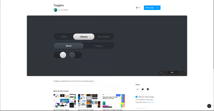
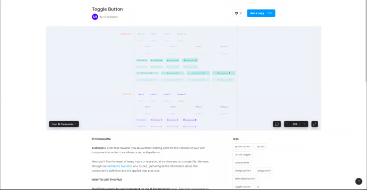
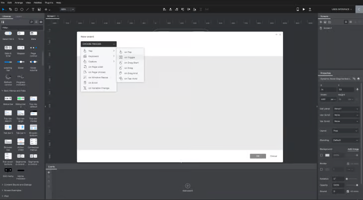
Figma
Figma is best for designers and those who want to quickly conceptualise their ideas.
Figma has come a long way since its release in 2016. As a designer who uses Figma on a daily basis, I can say with total confidence that it is absolutely the quickest, most effective way to design toggle buttons.
Whether that be in wireframe format, or as a fully fleshed concept ready for development handover, Figma covers all bases. Thanks to a community of design helpers, it’s even possible to leverage the work of others and choose from hundreds of premade components!
If you’re worried about using premade components, perhaps because you believe there’s a lack of flexibility or that you won’t be able to change the style of the components you’ve copied over, fret not. Everything is entirely customisable, and ready to be copied into your own design system.
Figma is the industry standard design tool of choice, and it’s likely you’re familiar with it (or its design competitor, Sketch) regardless if you’re a designer, developer, or you work alongside either. Some might suggest, however, that Figma is lacking as a prototyping tool. This probably isn’t that big an issue to most, as the creation of the toggle button is probably the most important, but it’s definitely worth highlighting.
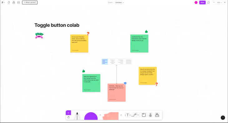
If collaboration is important to you, then Figma has you covered. From its inception, collaboration has been key. For creating a toggle button, or a series of toggle buttons, it’s super easy to share the design with the team and get immediate feedback on your work.
Using Figjam, an additional collaboration tool that uses Figma’s collaboration technology, you can sketch, doodle, and gamify the design experience to ensure your toggle button works in any business context. No more emailing PDFs, no more asking Jane if she got the latest designs. Invite Jane into the artboard and collaborate.
The starter tier of Figma is free.
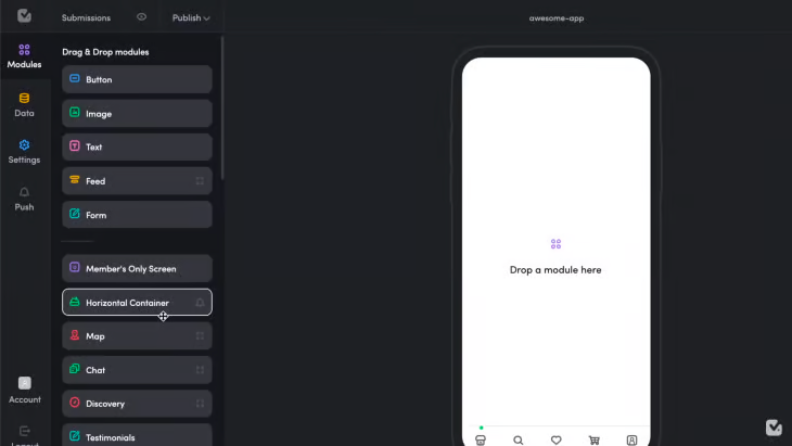
Mockplus
Mockplus is best for stakeholders or nontraditional designers, and those who want to quickly conceptualise their ideas.
As established, Figma will tick a lot of boxes for a lot of people, particularly designers. But not everyone has the level of confidence, or time, that might be required of Figma. As mentioned, one thing it’s lacking is the level of interactivity displayed when creating prototypes. That’s where tools like Mockplus come in.
Mockplus exists as a solution for those who want to design interfaces but perhaps aren’t designers by job title. The interface very much emphasises itself as a drag-and-drop interface, an all-in-one design application that makes prototyping a cinch.
Mockplus is great for folks who don’t have the time to learn a new design tool like Figma, or for small startups that don’t have a dedicated designer. There is the option to import artboards and assets from Figma to Mockplus, with the added benefit of being able to use Mockplus’s prototyping engine to present killer designs to stakeholders.
Interactivity comes as standard with Mockplus. Great for folks that need to present, for example, a sign-up flow, and as part of that flow, a toggle button that allows users to select different membership tiers. Mockplus takes the guesswork out of what happens when you interact with the toggle button and takes the guesswork out for stakeholders who want to see quick results.
The basic tier of Mockplus is free.
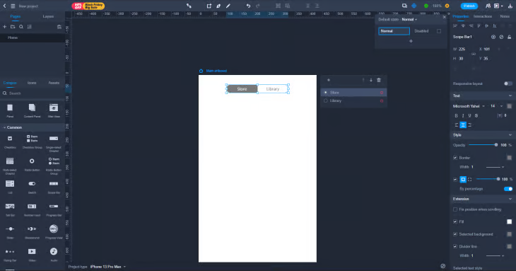
Justinmind
Much like MockPlus, Justinmind is best for stakeholders or nontraditional designers, who want to quickly conceptualise their ideas.
As an alternative to Mockplus, Justinmind is another tool that seeks to bridge the gap between self-proclaimed designers and non-designers. Just like Mockplus, Justinmind claims their drag-and-drop interface enables users to power through designing concepts with multiple, interactive components to choose from. On the left-hand side, you have a panel full of popular components, which of course includes ready-to-go toggle buttons.
Justinmind is another potential option for those who don’t want to invest their time into learning a new design tool, such as Figma, because most of their time is traditionally spent elsewhere.
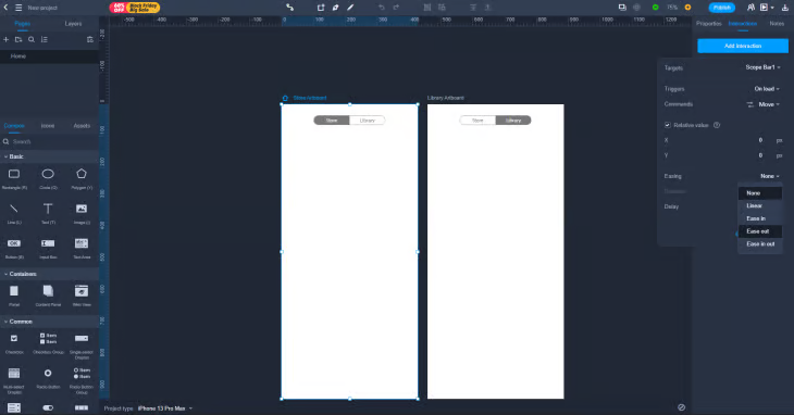
Whereas Mockplus allows users to import designs from Figma, Justinmind is different in that it works symbiotically with Figma. What does that mean? As per the Justinmind support website, this is what they say about working alongside other design tools:
Justinmind is especially powerful in making designs interactive and simulating web and mobile apps as realistic as the user needs. Once you bring a design from Figma to Justinmind using the Copy SVG code, you can select any layer and add events to it.
This is again a particularly useful feature that allows the visualisation of our work and resembles something closer to the finished product before it’s handed over to the engineering team for development. What better way to show exactly what happens when a user clicks between different options in that multi-item toggle button?
The free tier of Justinmind is free.
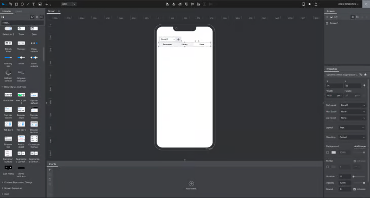
V.One
V.One is best for tinkerers who want to design and implement at the same time. Create the look and feel of your toggle button, while V.One compiles the code in the background.
According to Chris Wanstrath, the CEO at GitHub, “The future of coding is no coding at all.”
No-code is a relatively new movement that empowers those who aren’t from a technical background. If you want to actually build systems and interfaces on iOS or Android, something that up until now has been reserved for engineers, you can! Not just a trend, but a growing movement amongst technology enthusiasts and entrepreneurs.
At its core, V.One is an interface builder. It shares similarities with the tools we’ve mentioned so far, but the key difference of being a part of the no-code space is that whatever you can design, you can launch it as a website or an app.
V.One has been making huge strides in the no-code space. Positioned as a one-stop shop to create online applications, especially those that fit the dashboard paradigm, V.One empowers users by allowing them to rapidly iterate ideas that are ready to ship. Prototype, iterate, launch, and scale your ideas.
Drag-and-drop is the name of the game here, with an option to peek behind the otherwise simplified interface if you’re brave enough to get your hands dirty. Dragging components from the left-hand side allows you to build up your application. Whether you’re building a new travel app or building out a great idea for a new SaaS platform, V.one has plenty of components to choose from, which of course includes accessible, well-considered toggle buttons.
The starter tier of V.One is free.
FlutterFlow
Combining the best of both worlds, FlutterFlow is for those that are happy to tinker — but designers, particularly web-based, should feel right at home with its interface.
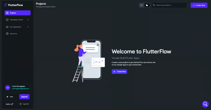
Another darling of the no-code space, FlutterFlow has made strides just like V.One, empowering users who want to “create beautiful UI, generate clean code, and deploy to app stores with one click”. If V.One’s relative youth within the no-code market doesn’t fill you with confidence, perhaps Flutterflow is the alternative you need.
Flutterflow boasts a serious selection of clients too, from Rakuten to Lumen, highlighting that not only is no-code here to stay, but so too is FlutterFlow.
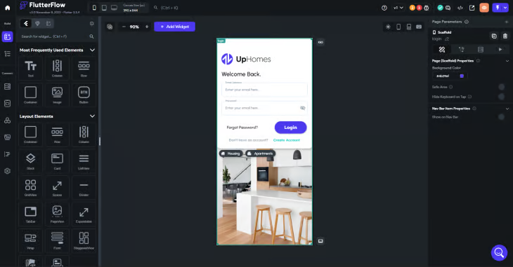
The starter tier of FlutterFlow is free.
Summary
There’s no question that we live in the age of choice. Regardless of who you are, or what your job title is, a tool exists for all. Whatever your app or website idea, there’s a very good chance a toggle button will be a part of it. The best thing of all? The tools listed above allow you to design, create, and share your toggle button with teams of people.
Not only that, but these tools allow us to create toggle buttons that adhere to the fundamental standards we addressed at the beginning. A toggle button should be self-contained, easy to decipher at a glance, use appropriate labelling or icons, and be accessible. I’m happy to say that we can do just that, regardless of what tool you end up using.


Comments ()