
Tesla Has a Design Problem
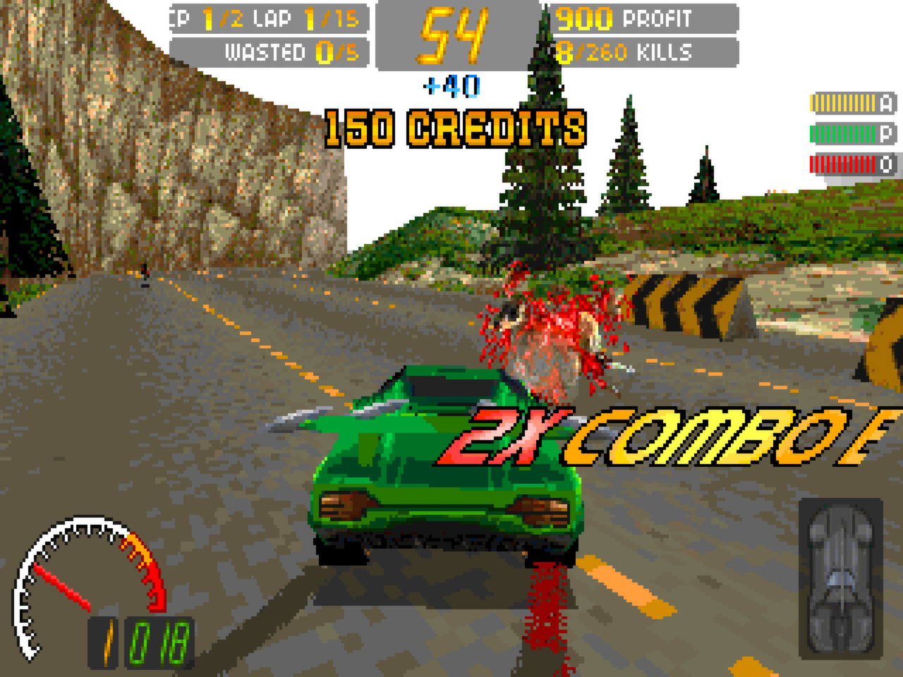
It seems the Cybertruck would be better suited within the world of 90s video game Carmageddon than downtown LA.
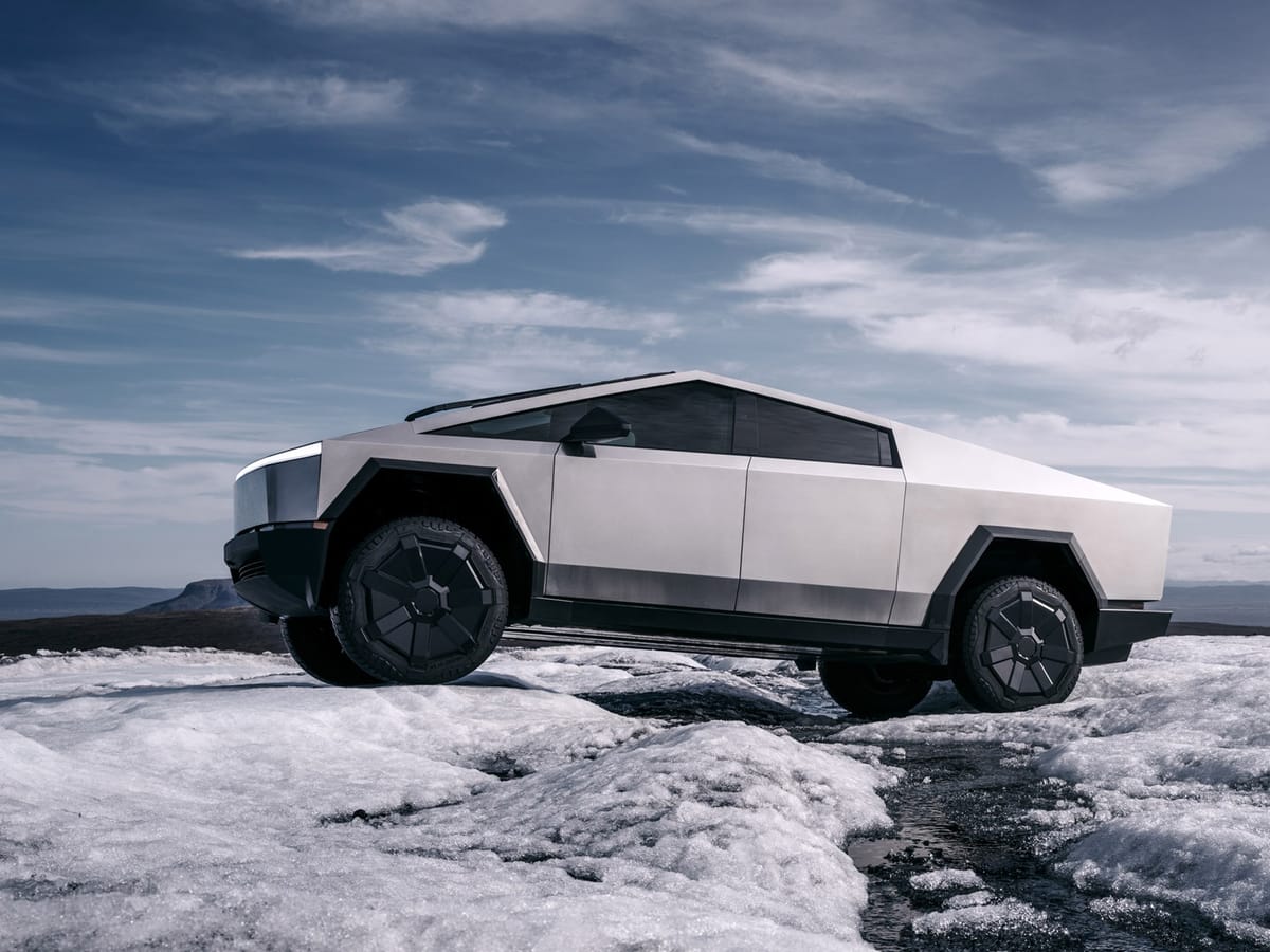
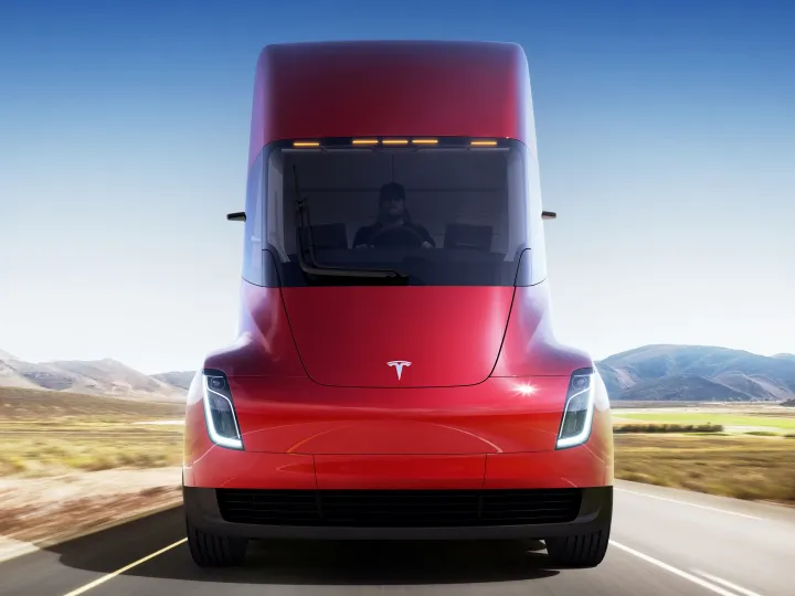
The Cybertruck is out on the streets of America, and people are talking. Not all of it good, mind, as it's likely the most divisive vehicle in recent times.
To put it mildly, it's quite the departure from contemporary vehicle design.
Beauty is in the eye of the beholder, of course, but whether or not you think it looks futuristic and purposeful or more like a kitchen appliance on wheels, is entirely subjective.
It's unique, I'll give it that.
Though personal taste plays a role in how the truck looks, my real issue is that I believe it's trying to solve problems that don't exist.
The entire project, at its heart, seems like design self-indulgence, a masturbatory creation for one, rather than the practical application of vehicle design for the many.
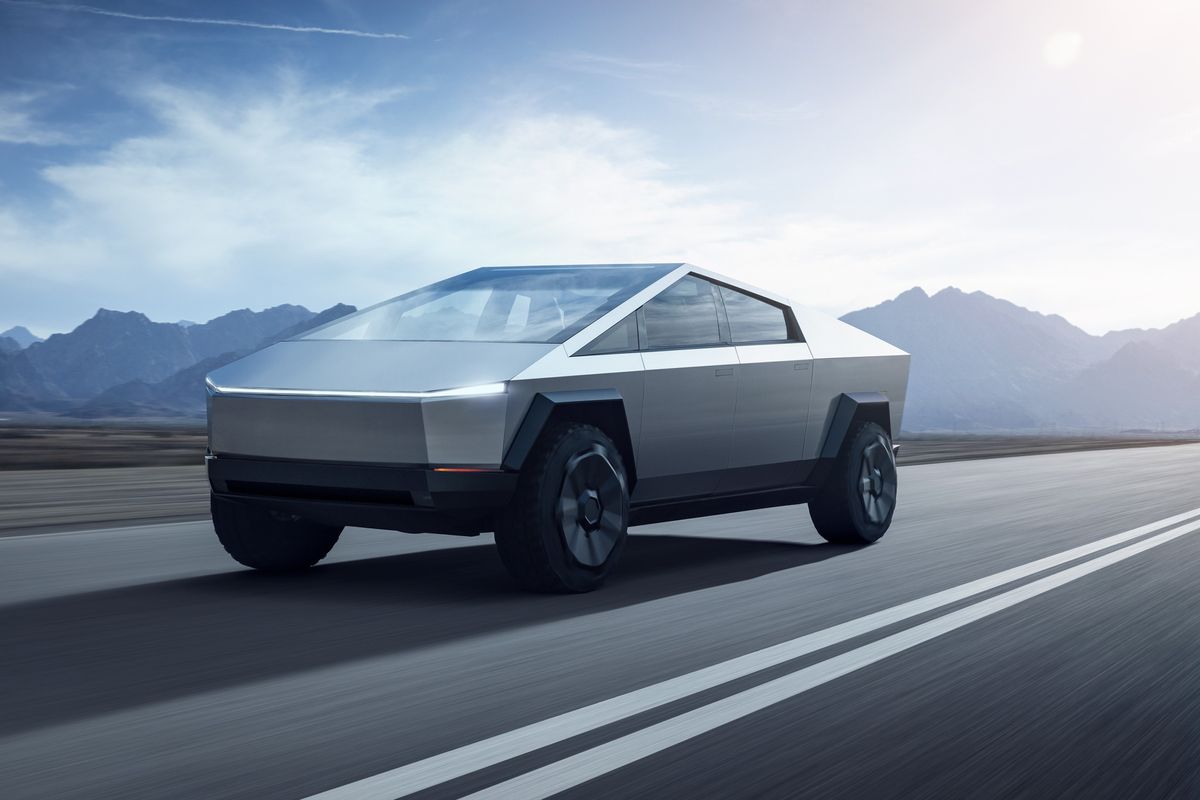
On certain early versions of the truck, there seems to be a problem with the absence of recovery points. This means if an F-150 needs to tow you out of the real world, the line has to be attached directly to the Cybertruck's axle.
Yikes.
Then of course there's a great deal of talk about pedestrian safety, or rather, the apparent lack of it if you happen to be on the end of this thing at 30MPH.
It seems the Cybertruck would be better suited within the world of 90s video game Carmageddon than downtown LA.
Things don't seem much better on the inside with an apparent lack of crumple zones.
"But Chris, it just looks so cool, surely you can overlook all those teething issues?"
No, because this isn't the first time Tesla has released a product promising all the bells and whistles, only to provide customers with features that fall short of expectations.
Tesla is sticking by their design, through thick and thin stainless steel.
I could go on, but I think ultimately this truck is the product of an ingrained design culture problem at Tesla, and by extension, a fear of saying no to Musk.
Crumple zones are designed to absorb impact energy during a collision so that most of the energy is dissipated across these zones, and not in your passenger compartment. - Volkswagen UK
The Cybertruck simply brings attention to longstanding design issues that have been present in Tesla vehicles for quite some time.
Most are willing to overlook these issues, so long as they're part of the Tesla EV club. But for how long?
For a company that's very vocal about designing great experiences, they sure make some odd design choices across their whole range.
From opening hatchbacks that allow water into the rear to weird steering wheel designs that no one asked for, let's have a look at other design decisions that have caused frustration for Tesla customers.
No Need To Reinvent The Wheel
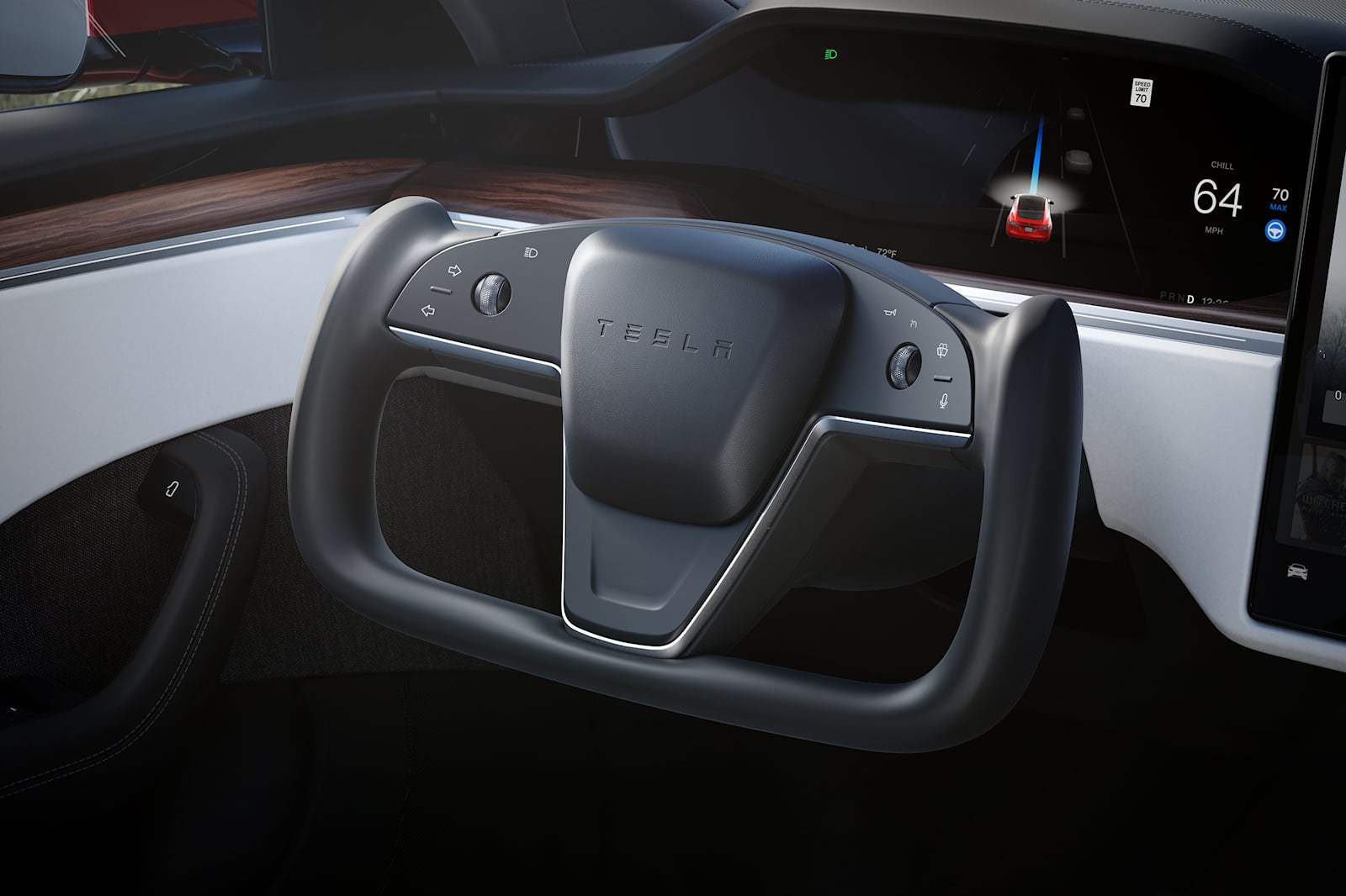
Tesla's adoption of the yoke-style steering wheel in some of its vehicles, including the Model S and Model X, has stirred both curiosity and criticism within the automotive community.
The yoke design, resembling the letter "U" or a racecar steering wheel without the upper segment, deviates significantly from the conventional round steering wheel.
"God, I wish my steering wheel looked light something out of a fighter jet," said no one ever. But what Elon wants, Tesla customers get, whether they like it or not.
Critics argue that this departure from the well-established round steering wheel design introduces unnecessary challenges and could potentially compromise safety and ease of use.
It appears Tesla is aiming for a "futuristic and aerodynamic aesthetic", something that a traditional and practical steering wheel seemingly cannot provide. The yoke fundamentally introduces challenges in terms of familiarity and ergonomics.
With many drivers accustomed to the traditional circular steering wheel, which provides a comfortable and intuitive grip, the yoke's unconventional shape has raised concerns about driver control.
Some customers claim it to be less intuitive and more cumbersome, impacting the overall driving experience.
Furthermore, the absence of the upper portion of the wheel raises questions about its functionality in terms of signal operations, windshield wiper controls, and other features traditionally located on the steering column.
Tesla is banking a big part of their future on self-driving tech. For better, or worse. That's probably why they steer clear of having too many physical buttons in the car cabin, aside from wanting a minimalist experience.
The yoke design integrates touch-sensitive buttons, adding a layer of complexity that may require more attention from the driver. This simply isn't good enough, especially within the context of a heavy vehicle such as the Cybertruck.
Critics argue that this departure from the well-established round steering wheel design introduces unnecessary challenges and could potentially compromise safety and ease of use.
As automotive design continues to evolve, the yoke-style steering wheel exemplifies a bold departure from convention, prompting discussions about the balance between innovation and practicality in the pursuit of a futuristic driving experience.
In the automotive industry, form should always follow function.
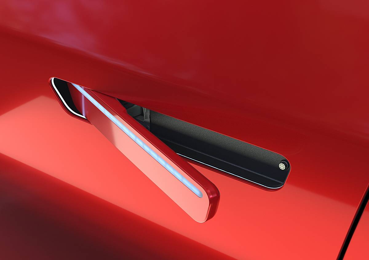
Tesla's Recessed Handles: Aesthetics vs. Function
Don Norman is a renowned cognitive scientist and design theorist known for his work in the field of human-centred design.
He has had a significant impact on the understanding of how people interact with technology and products. Norman's expertise extends to user experience design, cognitive psychology, and the broader concept of design thinking.
He's a bit of a clever clogs, and even now, when he talks I listen.
He's the starting point and source of inspiration for many designers, like myself. I know he'll also be familiar to many of the design staff at Tesla. Probably more so than in my area of expertise, user experience in the digital realm.
Rather famously, Norman introduced the concepts of "affordances" and "signifiers" to elucidate how users perceive and interact with objects. It was a big deal when he first coined these terms, and now, they're common knowledge within the design industry.
But, as it turns out, Tesla seems to be drawing inspiration from Sol LeWitt's minimalism when it comes to designing their car door handles, rather than the more practical design knowledge from Norman.
On a door, well, let me just show you an example:
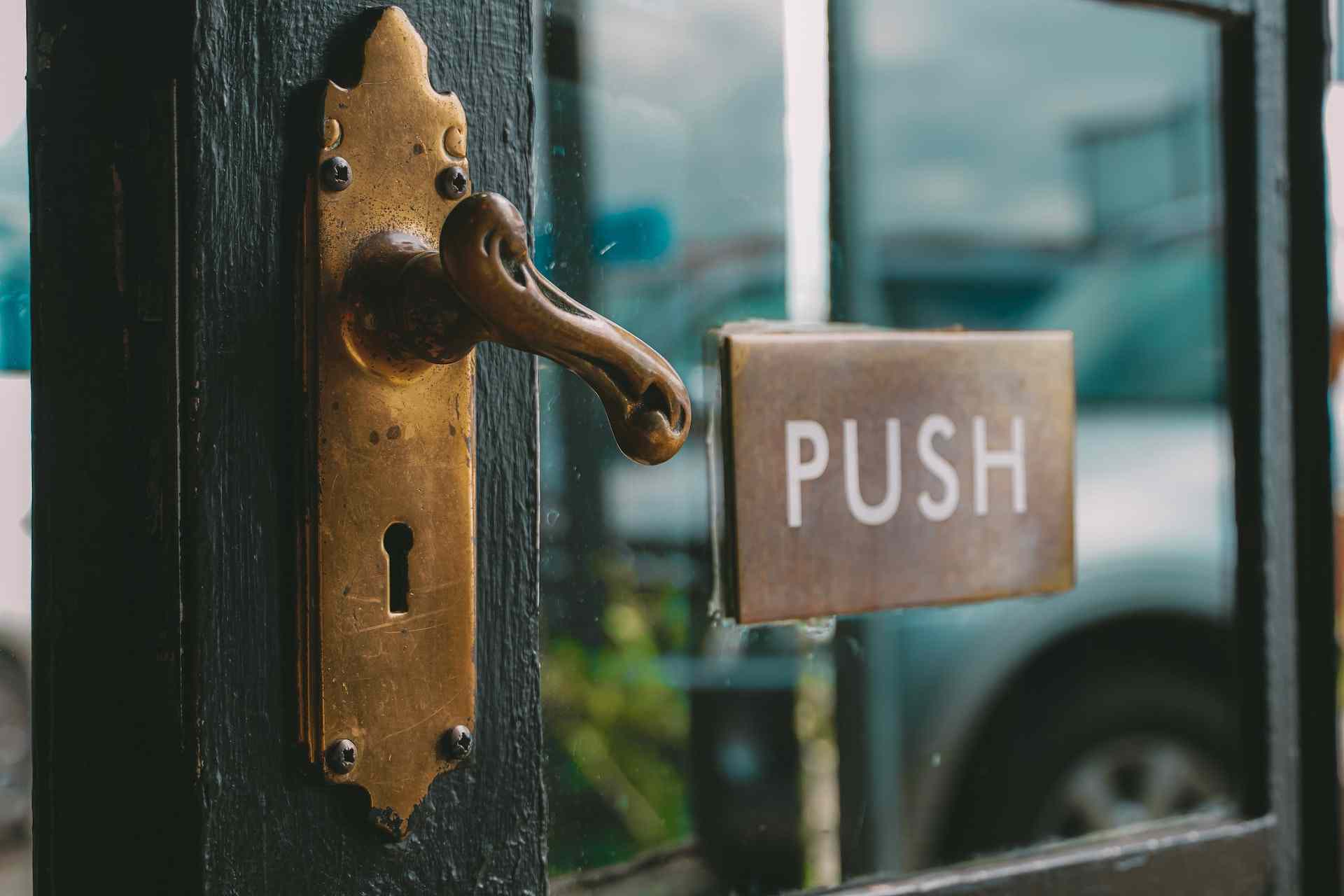
Signifiers, on the other hand, are signals or cues that convey information about how an object should be used.
Notice how the above door has a pull handle? Well, to stop people from feeling embarrassed, there's now a signifier in the form of a push sign telling people how to use it correctly.
It's entirely possible if the door worked as people thought it would, pull the handle down, pull the door open, that that sign wouldn't be needed.
But we live in a world where doors need to be pushed rather than pulled, and we're left standing there, befuddled and questioning our door-opening skills.
Couldn't happen to Tesla though, right?
Cars have been on roads for long enough that people know how to get in and out of them. Pull the handle, pull the door, and get into the vehicle. Easy!
Not so with Tesla. Or with the TVR Chimaera, but that's a story for another day.
In the context of cars, clear affordances and signifiers ensure that drivers and passengers can easily understand and operate various elements, from door handles to dashboard controls, contributing to a safer and more user-friendly driving experience.
It's so important to get this right in the context of a vehicle.
Norman's insights have significantly influenced design thinking, emphasising the importance of creating products that align with users' mental models and expectations.
Tesla's decision to use recessed door handles is a distinctive design choice, aiming for a sleek and aerodynamic look, but as usual, at the expense of practicality.
Lack of Buttons

In Teslas, the notable absence of physical buttons inside the vehicle is a design choice that has garnered both praise and criticism.
I've written about this countless times, and studies have been quite definitive that burying what used to be a physical button somewhere within a touchscreen is a bad idea.
You're probably noticing a bit of a trend at this point, but the minimalist approach aims to provide a "sleek and futuristic interior". By embracing a large touchscreen as the central control hub, there's little need for "clutter" on the dashboard.
However, this departure from traditional buttons and switches has only one advantage: Offering a clean and uncluttered aesthetic. That's it.
Some users find the reliance on the touchscreen for essential functions, such as adjusting climate settings or volume, to be less intuitive and potentially distracting while driving.
Regrettably, some carmakers chose to mimic Tesla's aversion to buttons, going for a simpler look. On a positive note, the automotive world is shifting back, with a few manufacturers advocating for the retention of physical buttons in the interest of safety.
While the touch-centric design aligns with Tesla's commitment to innovation, it raises concerns about accessibility and driver distraction.
Traditional physical buttons allow users to locate and interact with controls without diverting their attention from the road. The touchscreen interface in Teslas demands more visual focus, as users navigate menus to perform routine tasks.
Physical buttons are increasingly rare in modern cars. Most manufacturers are switching to touchscreens – which perform far worse in a test carried out by Vi Bilägare. The driver in the worst-performing car needs four times longer to perform simple tasks than in the best-performing car. - vibilagare.se
Despite the divided opinions on the absence of physical buttons, Tesla will continue to push the boundaries, for better or for worse, of automotive design.
Looking at the Cybertruck, it seems they believe they've got a good handle on what's best for you.
Time will tell.

Comments ()