When you think of IBM, what comes to mind?
Blue suits, mainframes, and maybe the classic striped logo. But in the 1980s, Paul Rand—IBM’s longtime design partner—slipped something a little different into the mix.
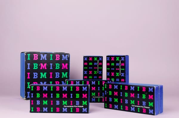
These boxes are a great example. At first glance, they’re just packaging. But look closer and you’ll spot something odd for a company like IBM: color.
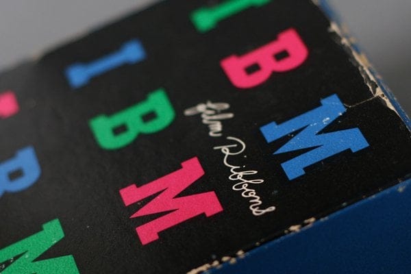
Not one, but four—pink, red, green, and blue. And not in neat alignment either. The letters bounce around in a grid, almost like a child's building blocks.
It’s IBM’s logo, sure, but it’s been loosened up. This wasn’t your usual tech branding.
Paul Rand knew what he was doing.
He didn’t redesign the logo—he just played with it. He kept the bones (the iconic striped "IBM" letters) and gave it rhythm. The result was a set of boxes that still said "IBM," but in a way that felt fresh.
Approachable, even. It was a clever move. You don’t often see major corporations give designers that kind of freedom. But Rand had earned it. By then, he wasn’t just a designer—he was the designer.
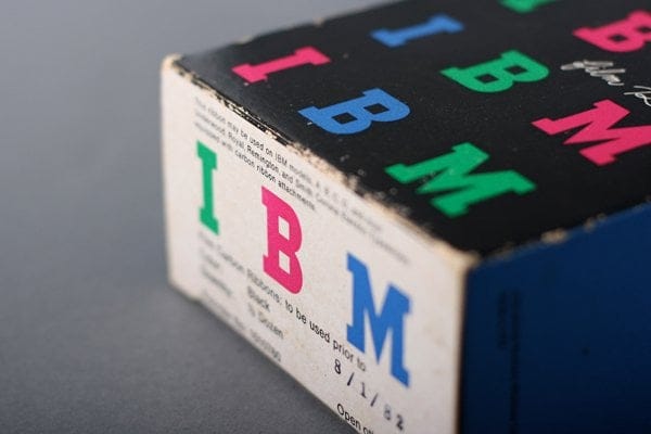
The guy behind logos for ABC, UPS, and Westinghouse. IBM trusted him to bend the rules a little. The boxes were part of a larger effort to make IBM’s design language more flexible.
These weren’t products for the average consumer—they were internal or limited-use items—but the message was clear: IBM could be serious and stylish.
There’s a lesson here for today’s brands. Consistency matters, but so does knowing when to shake things up. Rand didn’t break the system. He just reminded everyone that systems can breathe. And that, sometimes, a little color goes a long way.


