
Crafting User-Friendly Website Menus for Improved UX
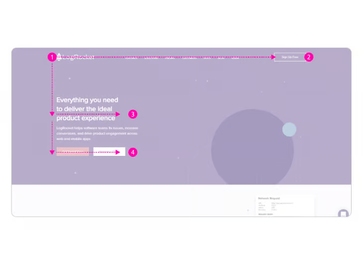
Clear website navigation is crucial to the success of any website. Users not only use website navigation to move from page to page but to also determine where they are at any given moment

Clear website navigation is crucial to the success of any website. Users not only use website navigation to move from page to page but to also determine where they are at any given moment. Like a guiding north star, if a user has any doubt, they should be able to look to the navigation for directions.
But what happens when the navigation itself is problematic? How can we guarantee how menu items are categorized makes sense? What if the menu design doesn’t match a user’s expectations entirely? The prevailing sense from users will be frustration.
Users aren’t likely to stick around if they become frustrated, and plenty of research suggests this is the case. There’s a legitimate chance they’ll simply go elsewhere, to a competitor’s website, rather than persevere with what they see as a broken navigation menu.
It’s important to consider the user from a goal-driven perspective. We can safely assume that most users want to achieve some goal (or goals) when visiting a website. Whether that be to catch up on the latest news, order a pizza, or search for local health services.
Good website navigation helps users achieve goals. It makes it obvious where a user needs to go to fulfill them. It’s vitally important to the success of a website to get the navigation right, so let’s talk about what website navigation is, the different navigation systems that exist, and best practices for navigation that assists users effectively.
What is a navigation menu?
Website navigation is a system of menus and links that allow users to navigate through the content and pages of a website. It usually includes the main menu, dropdown menus, and links to other pages within the website.
A navigation menu is designed to help users find the specific information they are looking for quickly and easily. This is the fundamental nature of what a navigation system is, and this is always true, regardless of what type of navigation is implemented.
With that said, let’s have a look at the different types of website navigation that exist and consider their use cases.
Horizontal bar navigation
Horizontal bar navigation is a navigation style most users are familiar with. Horizontal navigation has been around since, well, the dawn of the internet. As the name suggests, a horizontal bar with a series of links runs across the top of the page, within the header, containing the most important, top-level, items of navigation.
Theoretically, this style of navigation could be placed at the bottom of the screen, but this is exceptionally rare and goes against the generally accepted wisdom that navigation remains at the top of the screen.
N.B., as a general rule of thumb, you should have no more than seven top-level menu items within horizontal bar navigation. Exceeding this number can make the navigation appear cluttered and difficult to use.
On desktop, top-level items with nested sub-level items are normally shown with a chevron (⌄), pointing down. On mobile, it’s not unusual to see a plus symbol (+) that signifies more menu items, and a minus symbol (-) to hide those menu items. Without these small signifiers, any items categorized as subitems would be invisible to the user.
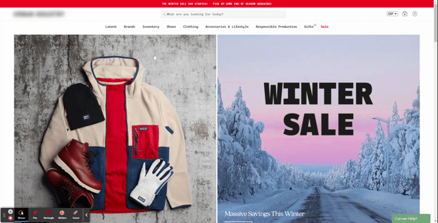
Mega menu navigation
For complex websites that have many different categories and multiple subcategories, a mega menu is generally the best way to go. Mega menus require careful consideration and planning due to their complex nature. This is especially the case on mobile. For website navigation this complex, it is critical to get the categorization correct.
Card sorting, the act of sorting menu items into categories that make the most sense, is an ideal method of categorizing items. You can read more about this in the best practices for good navigation section.
Most mega menus take the form of a horizontal bar navigation. When a user hovers over a top-level item, further subcategories are revealed. If you’ve visited a large e-commerce website such as Amazon, you will have seen this type of menu in action.
N.B., advertising in mega menus should be avoided. There are plenty of examples of large ecommerce companies splitting their mega menu in such a way that they add graphical advertisements to drive traffic toward certain parts of the website. Don’t do this! Mega menus should only be used for navigational links.
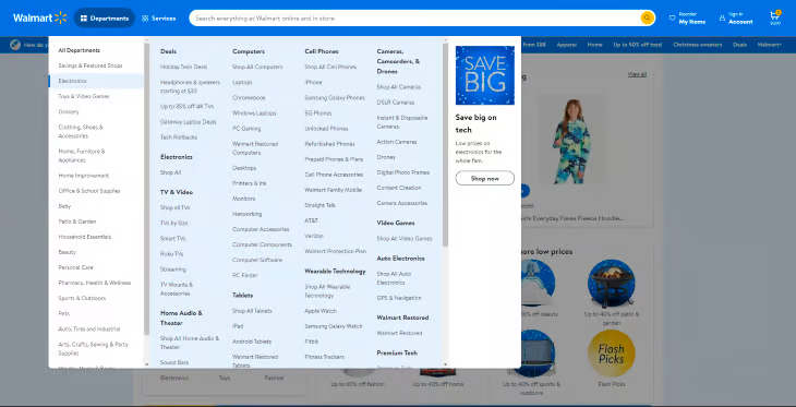
Some mega menus can, however, take on a slightly different form, either adapting a vertical sidebar navigation approach or a hybrid approach that takes both horizontal and vertical approaches, such as this example from Walmart.
Breadcrumb navigation
If a website has a mega menu dropdown, there’s a good chance the website is complex enough for the implementation of breadcrumb navigation.
Breadcrumb navigation is like leaving little breadcrumbs behind you as you venture further into the website. If the user becomes lost at any point, they can return to an overarching category by following the breadcrumbs backwards.
Vertical sidebar navigation
Vertical sidebar navigation is somewhat unusual, in that while it exists as a well-defined design pattern for navigation, it isn’t used very often.
Vertical sidebar navigation is great for displaying lots of content items, and content items with longer titles, because of the available vertical screen space. Because of this, vertical sidebars are often popular within the context of SaaS dashboards, and can even give users the option to slide the menu off the canvas, giving the content within the dashboard more prominence and focus.
There are some more obvious benefits to using this navigation style, one of which is easier to scan. When users are scanning, they tend to scan in an F pattern. Primarily, left to right, up and down.
This being the case, the vertical sidebar navigation does lend itself to being a more logical design for that purpose. When scanning the screen with vertical navigation, users don’t have to scan the entire width of the screen as they would with more traditional horizontal navigation.
Perhaps where this menu breaks down, however, is in situations where a complex mega menu is a necessity. Rather than working from top to bottom, the menu might expand out 2 or even 3 subcategories, forcing the user to use an unfamiliar complex design pattern rather than the more traditional horizontal approach, which is much better at giving users context for each category they work down.
Hamburger navigation
The hamburger button has been around since the late 80s, believe it or not, but only within the last ten years has it risen to prominence because of one device: the smartphone.
Users browsing the web on their devices have grown exponentially, and so designers sought a solution to display navigation in a way that best fits the size of a mobile device. The implementation of the hamburger button is not without controversy, however, sparking a debate around whether or not users have a clear understanding that three horizontal lines represent a means of navigation.
However, given its prevalence, the hamburger button approach to navigation has become an accepted standard in mobile device navigation.
The general design pattern is to display the hamburger on the lefthand side of the canvas, which slides out a navigation drawer from the left, though the exact position isn’t set in stone. The key is to include it at the top of a mobile device, though this causes potential issues for one-handed use.
On activating the hamburger, the list of items is then displayed top to bottom, but it’s also possible that the top right of the menu will have an X signifying that if pressed, the menu will close.
What about displaying a hamburger button on desktop? Generally speaking, this is bad practice and is normally limited to websites that cherish design aesthetics above all else, such as art-related or agency websites. Some designers choose this style of navigation on desktop because it appears “cleaner,” therefore lending itself to the concept of minimalism. This can come at the cost of creating friction for the user, so think carefully about this approach!
N.B., unfamiliar users find less friction when menu items are appropriately labeled, and this includes the menu itself. Rather than just showing the standard three-line approach for the menu, label it with the word menu as well!
Bottom navigation bar
A bottom navigation bar in the context of a mobile website is a type of website navigation located at the bottom of the device it’s being viewed on. It typically consists of four or five links to different sections of a website and is designed to allow users to quickly access different sections without having to scroll back to the top.
Another key benefit of having navigation at the bottom of a mobile device in particular is the ease of reach for users, particularly those that browse with one hand.
Best practices for good navigation
Information Architecture
So we’ve established the primary purpose of website navigation, and that is to help users navigate from page to page or section to section on a website. However exceptional website navigation also helps users understand the context and content of a website. The most effective website navigation carefully considers the overall information architecture of the website, which plays a big role in informing the structure of the navigation itself.
This is especially crucial, given we know users tend to scan content quickly, rather than obsess over every little detail. Think of it like driving 40mph in a busy town and reading street signs to orientate yourself. Being able to scan well-structured navigation quickly helps users establish their position, reorientate themselves if lost and invest further time trying to achieve their goals.
But how do we ensure navigation is well-structured? Let’s consider the following:
- What kinds of content does the website serve?
- What themes are being tackled, and can these be broken down into subthemes?
- What navigational items should be included in the menu?
- Can we conduct a card sort with users to validate our current information architecture?
- How should items be structured, and how should subitems be structured?
- How many top-levelHow many top-level items can we place on the main navigation?
- Do we need secondary navigation?
Much of the work in creating effective navigation comes from the organization of information itself. This is known as information architecture. This is the very essence of good navigation — organizing categories and subcategories in a way that users find intuitive.
My favourite way to ensure navigation makes sense to users is to use card sorting. If you’re not familiar, card sorting is the act of taking individual menu items and sorting them into groups or themes. The goal is to organize items in a way that makes the most sense to whoever is sorting them; usually, participants that have been invited to the session.
Whether or not an open or closed card sort is used, the ultimate goal is to create a system of navigation that reflects how an average user would navigate the website.
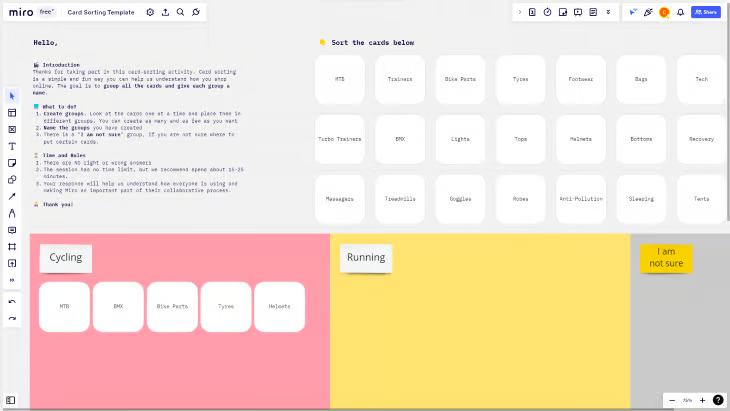
N.B., during an open card sort, participants are given cards with navigation items already on them. They then organize these navigation items into what they consider to be most sensible. On the other hand, closed card sorts require participants to not only organize items but to put them into pre-existing categories.
Use descriptive, simple labels
When designing website navigation, I’m often reminded of KISS. No, not the 1973 rock band fronted by Gene Simmons, but the acronym “Keep It Simple Stupid,” a term first coined by Kelly Johnson, lead engineer at Lockheed Skunk Works.
The underlying principle is itself simple: systems should be as easy and intuitive as possible to engage with. If they’re not, why is that? Always asking questions, and always trying to determine if something I’m working on adheres to the KISS principle, has helped me be more considerate as a designer.
Let’s consider the homepage of an e-commerce website. If a user finds the navigation too complex because of poorly labelled menu items, there’s a very good chance they’ll immediately abandon it because they’re frustrated. Remember the goal-orientated user — if a user doesn’t think they’ll complete their goals, they’ll go somewhere else to make it happen. Good navigation alleviates confusion and uncertainty. It assists rather than hinders.
Let’s take a look at the below example:
| Products | Services | Brands | ||||
| Cycle | Run | Swim | Triathalon | Outdoor | Fitness | Training |
The above mirrors a similar situation when I used to work for a large retailer in the UK as part of their UX team. After conducting user research, we concluded that the old navigation wasn’t descriptive or immediate enough. Much of the feedback from users was that what the company sells is obscured with poor labelling.
Effectively, Products, Services, and Brands were too generic and slightly ambiguous. Our solution was simple: take specific subcategories and repurpose them as overarching categories, suddenly making our product offering more obvious.
The result was a navigation system that gave users more confidence to accurately navigate to categories and products, but one that also helped the business achieve its own goals. It’s also important to note that six or seven menu items are generally regarded as the maximum before the navigation appears cluttered and perceived as complex, so the team and I ensured we never went over this limit.
N.B., never use internal language that will alienate users. While it might be second nature to call something T&G internally, using Toys & Games is much more obvious to users.
Navigation hierarchy
Navigation hierarchy is the way in which titles and navigational items are arranged in the navigation itself. Overarching sections are normally styled as a header, with subcategories underneath each overarching header. This is a well-established design pattern that is particularly good for scanability because each section is clearly defined and obvious to the user.
Having a clearly defined hierarchy also has the benefit of working on any device, be that desktop, tablet, or mobile. When separating elements of a webpage or app, white space is your friend. White space, or negative space as it’s sometimes referred to, is a way to subconsciously signify separate areas of the product to a user. By “chunking” areas into their logical places, users find the experience more understandable, less stressful, and are more likely to stick around.
Colour is also often used to denote different areas of navigation, but shouldn’t solely be used to denote different sections. Depending on colour alone to capture attention is bad for accessibility.
It’s common to see the navigation background colour differ from the rest of the website, further highlighting the navigation section, but clear headings and whitespace should be the first port of call for creating a navigation hierarchy that makes sense.
Don’t use a hamburger menu on desktop
At the risk of repeating myself, please don’t use a hamburger menu on desktop. For many users, navigation is something permanent and unchanging. It’s consistent, or at least should be, and as mentioned before, the best navigation systems demonstrate where to go if lost within a website. Understanding that critical aspect and why menu items shouldn’t be obfuscated makes clear why hamburger menus shouldn’t be used on a desktop website.
As for mobile devices, the hamburger menu is now regarded as standard practice for navigation and should be used as such. In order to remove any potential for misunderstanding, try labelling the menu with the word “menu.” This removes any ambiguity for those who aren’t totally sure what three horizontal lines represent.
When to use buttons, rather than text links, in navigation
It’s not unusual to see call-to-action buttons in navigation, though they should only be used to highlight one or two calls to action. Consider the business’s goal and the number one objective for visitors. Is it to get them to sign up? Perhaps it’s to get in contact? Whatever it may be, having one call to action in the navigation menu is a great way to highlight the primary objective of the website.
If we remember the F pattern users have a tendency to use when browsing the web, we know they’re more likely to pay attention to the first and last links in a menu, so consider this when designing the structure of the navigation.
Using animation
Using animations in website navigation is a great way to make a website more engaging and eye-catching, but should be used sparingly. Animations are normally used to create a more immersive experience, and can often appeal to users who associate animations with elegant design, but they can also be used to draw attention by providing more obvious visual cues.
Animations work particularly well when not just used for the sole purpose of delighting users, but to offer additional feedback for specific micro-interactions, as well as cues that can help users with accessibility needs. Microinteractions are simply a way in which a trigger, such as hovering over a menu item, provides user feedback. Coupling user feedback with subtle animations can make for a more enjoyable experience.
Animations can also be beneficial for those with accessibility needs, as they are more likely to notice a change has occurred on a webpage when animated appropriately. If a user doesn’t notice changes like this, this is called change blindness.
N.B., change blindness is a phenomenon that occurs when users fail to notice changes in a user interface. This can occur when changes are subtle or when users are distracted or focused on something else. Change blindness can lead to confusion and frustration if users are not able to locate certain elements on a page or if they’re unable to complete tasks on the website.
Summary
There are a number of navigational styles that can be used depending on the context, and while they’re styled differently, or positioned differently, they all fundamentally do one thing. Serve users in the best way possible, and enable them to navigate a website with ease and confidence.
While all navigation styles are appropriate to some degree, others should be used with caution, such as using a hamburger menu on desktop, or using an unconventional approach dependent on lots of animations. Know your audience, and understand if your navigation style of choice is working for them.
There’s always room for improvement, especially with such a fundamental aspect of website design.


Comments ()