
Exploring Component Properties within Figma
When component properties were announced by Figma during Config 2022, the design community was — rightfully — excited.
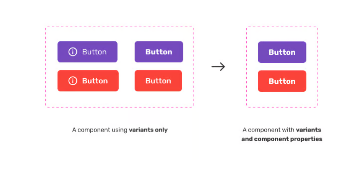
Promised as a powerful way to create a set of customisable attributes that can be applied to any object, component properties were touted as a way to increase productivity, resolve issues around variant duplication and make communication between teams simpler. How? By making design systems more streamlined, reducing the need to create multiple variants to cover various scenarios, and surfacing options in the components property sidebar, helping teams better understand what they can (and cannot) change on any given component.
From my own personal experience, general ambiguity and the number of negligible questions around component changes have dramatically reduced among teams.
In a nutshell, component properties allow you to set attributes such as colour and fonts. Layouts of certain components are still handled by variants, which can demonstrate how a component should look for different contexts, for example, mobile vs. desktop.
N.B., as a heads up, variants in Figma aren’t new. As they are considered a part of the component property feature set within Figma, I’ll be addressing them in this article as if they are.
Fundamentally, component properties make it easy to adjust the look and feel of an object without having to make major design changes. All in all, they’re a super powerful way to give you and your team more control, especially if you happen to be in the midst of maintaining or creating a design system.
From personal experience, I have found component properties fantastic for daily runway work with engineering teams. Being able to rapidly convey ideas and build prototypes using components with component properties has done wonders for our workflow. They also free up time for the design team to focus on discovery and more conceptual ideas for upcoming features further in the year.
I’m excited to share component properties with you. Ready to jump in? First, a primer on what you need to do to create a component, and ultimately, get component properties up and running.
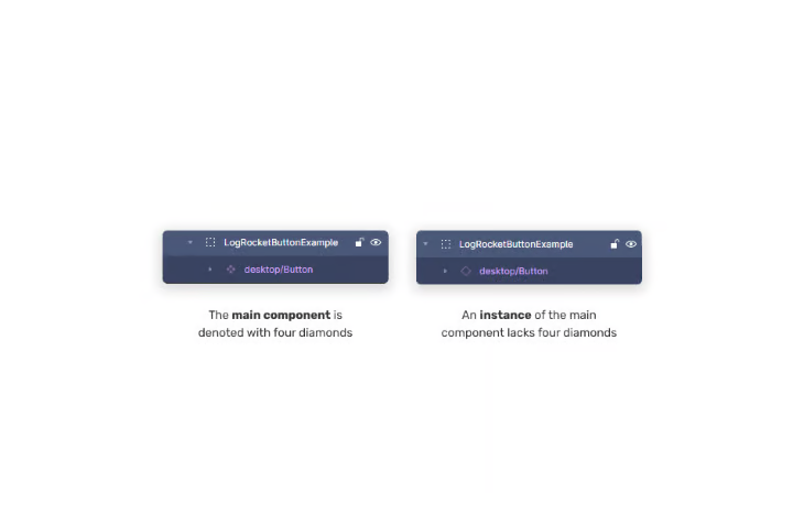
The main component
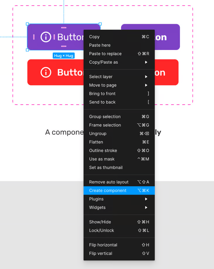
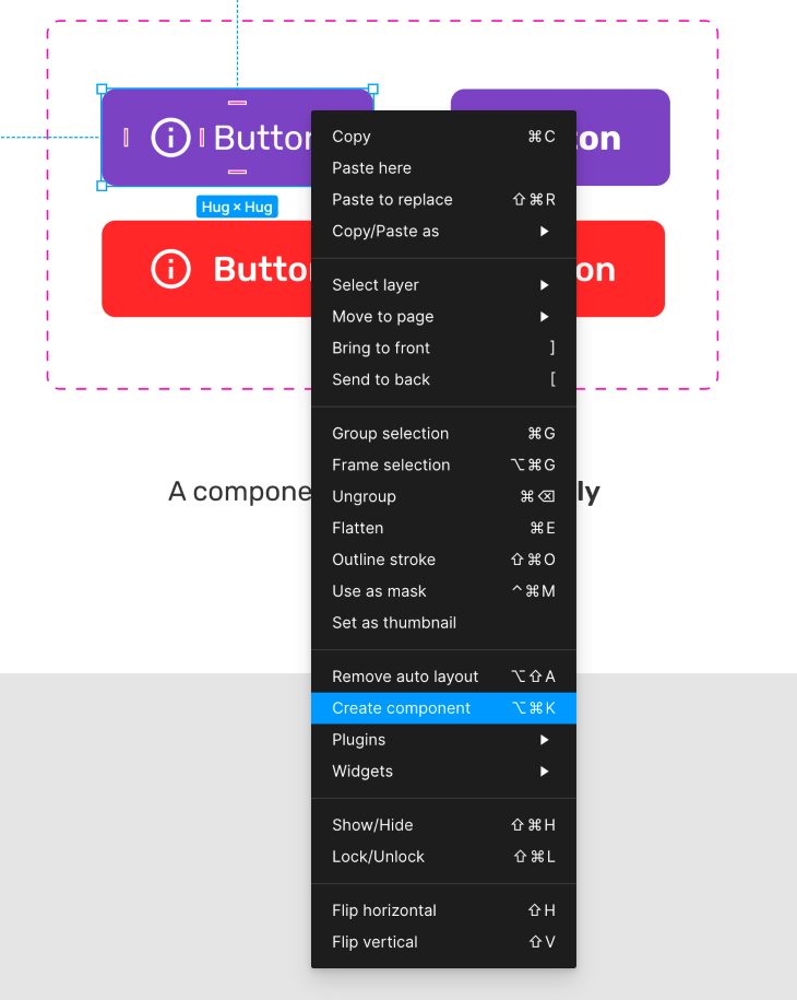
Components can be created from layers, groups, and frames.
To create a component, you must select either these layers, groups, or frames and then select Create component from the toolbar, or by pressing Windows: CTRL + ALT + K / Mac: ⌥ Option + ⌘ Command + K. You can also right-click your layer, group, or frame and choose Create component from the context menu.
Think of the main component as the source of truth for all instances going forward. It’s the foundation that must exist before instances can. In simple terms, it’s like copying and pasting. You can’t paste something if there isn’t something to copy. An instance is simply a copy of the main component.
An instance can have one or multiple variations, but the main component is always created first, and everything else is an instance (copy) of that. If the main component is changed in any way, all the instances are updated immediately to reflect the changes of the main component.
If, however, you edit an instance of the main component, then only the instance will be affected because each instance is considered unique.
With the main component created, let’s look at each individual component property in more depth, and explore how they can benefit designers.
Variant
Variants are ideal for different sizes, colours, styling, and states (i.e., Interactive).
We know that variants aren’t new, but it’s worth talking about them in the context of component properties — especially as Figma considers variants a part of component properties according to their own documentation. When a variant is created, it exists inside what’s known as a component set. A component set is a way to identify related components by grouping them together. In simple terms, buttons, tables, or even table cells can exist within their own component sets. It’s simply logical to group these together as related entities, especially folks who are new to your Figma projects.
The main benefit of variants is that they represent and carry specific attributes like size, layout changes, or state changes defined by variant properties. Need to design a button with hover states? Let’s have a look at an example of that below.
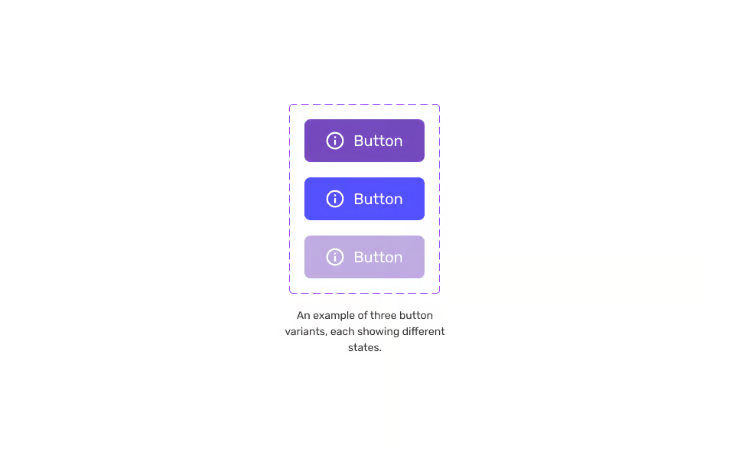
Imagine you want to design a button with different states like enable, hover, and disabled. Variants demonstrate to your immediate team or stakeholders, what all the different permutations will look like. Every possibility can be mapped out elegantly and bundled up into an in-house design system.
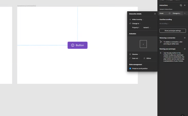
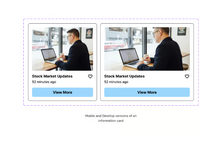
Or perhaps you’re creating a series of information cards, and want to show how they’ll look on mobile, tablet, and desktop? Variants have you covered. As well as that, If you want to add a degree of interactivity to your Figma designs, then variants are a must.
Interactivity is fantastic for showcasing your work to stakeholders. Using an example, again, of a simple button, we can demonstrate what switching between a hover and default state will look like once implemented by the development team. While this is a simple example, you can imagine the implications this will have on other components. Checkboxes, dropdowns, bottom sheets…the list goes on!
You can view this example here in Figma.
Here’s how you can use variants. First, you’ll want to select your main element and convert it into a component. We touched on that previously. Once done, select the component you’d like to create a variant from. In the example below, I’ve selected an information card.
When we select Add variant from the toolbar, the master component will be duplicated — essentially creating an instance. It’s important to note that each instance will be created and exist within a predefined component set.
As you can see from the below example, the left card is the main component for mobile designs, with the card on the right being a variant of that. That variant that I have created has been tweaked by me, and I’ve created a card that is now more suitable for desktop.
N.B., even though the purpose of component properties is to reduce the number of variants created, variants are still needed in specific situations. If you have a major design change like size or colour, then variants still rule. Communicating interaction, like a hover state or form interaction, can only be done using variants
Remember, variants are great for creating elements with multiple states. Being able to create, for example, one master button or information card that has multiple variations for different contexts is a huge time saver for solo designers and larger design teams.
Boolean
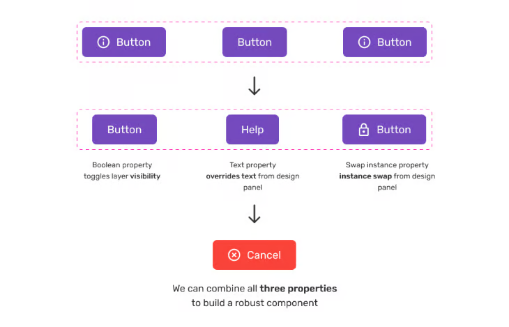
Booleans are ideal for being able to toggle visibility between items.
Boolean is a term that means something is either on or off. The light switch in your home is a good example of a Boolean control. Either the light is on, or off, depending on the position of the switch.
While Boolean is a simple concept in practice, it’s my opinion that this property is one of the most useful of all the component properties. By using the Boolean property in Figma, designers can show or hide certain elements within a component, and the option is conveniently displayed in the design panel.
Let’s look at an example you’re likely familiar with. Imagine creating a button that includes an icon. If you want the icon to appear inside the button, the Boolean property should be switched to on. If you don’t want to show the icon, the Boolean property should be switched off.
Simple, right? Let’s take a more detailed look at how to implement the Boolean property correctly.
Select your component. In this case, I have selected a button that houses an icon. Select the Component property button in the layer panel of the sidebar. Let’s name the property “has icon” and set the value to True. True in this example means on, meaning the icon will default to being visible.
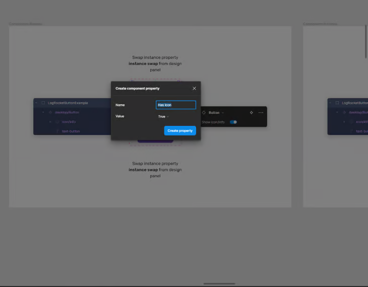
Select Create property. Congratulations, the “has icon” will now be displayed as a toggle switch in the button panel on the right-hand side of Figma. You can now toggle visibility on this element.
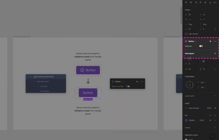
While we’re at it, let’s create a property to hide and show the text as well!
To do this, again, select the Component property button — but this time select Create property. Let’s name it “has text” and set the value to True. This means the default value will show text. If we now go back over to the property panel, we can find all the control properties in one place.
Controlling the visibility of certain elements on a canvas is a hugely powerful feature in Figma and one of the most used component properties with all the teams I’ve worked with.
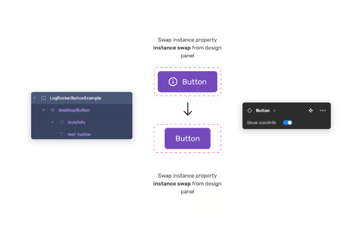
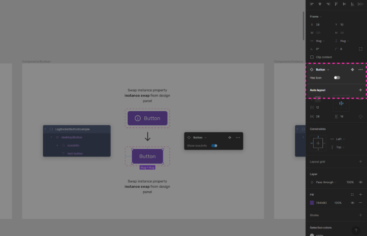
Instance swap
Instance swaps are ideal for customising instances quickly.
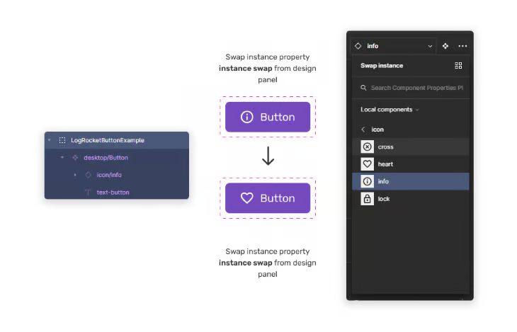
The instance swap property is a component property that allows us to swap a component directly from the dropdown within the property panel. By doing this, you don’t need to select a layer in the component itself to swap it. This is a great quality-of-life update that makes designing UI in Figma more streamlined.
I mostly use instance swapping when swapping icons inside components such as buttons, alerts, or navbars. Having a set of defined instance swaps in those contexts is great for larger teams too. With multiple designers jumping in and out of designs, having defined instance swaps communicates to the team, “These icons have been signed off and can be used in this context.”
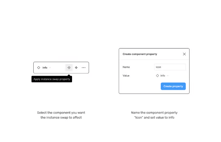
After selecting the component you want the instance swap to take place in, select the Apply instance swap property icon. Give the instance swap a name, and select Pick instance for the value.
At this point, you’ll be able to create what’s known as a “preferred list of values.” This is a way to set a default selection of icons that you or the team have decided to prioritise. The instance swap menu will now have a purple pill called Icon. Now, create an instance of the master component. Going back over to the sidebar, you’ll notice we can now use the component property controls to select a different icon using the dropdown.

A typical use case for the instance swap property in Figma would be for swapping elements within a design library.
For example, say you have a library of buttons with different styles, but you want to quickly change the style of one of them. With the instance swap property, you can quickly swap the button with another one in the library without having to manually delete and replace the existing button. This saves time and helps ensure consistency throughout the design.
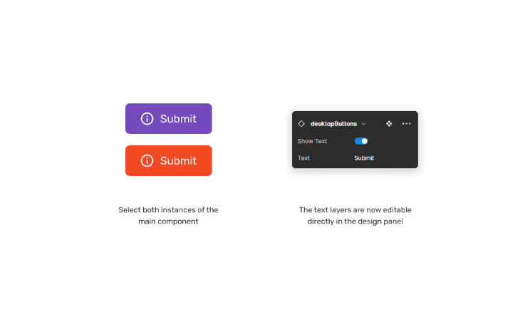
Changing text content quickly

The text property is the most straightforward of all the component properties. When enabled, you’ll now have the option to update the text layer directly in the properties panel, rather than potentially having to click down into multiple layers to eventually find the text you want to update. Changing multiple instances of text is also now possible as well.
Another neat benefit is creating a named value that reflects what the engineering team might be more familiar with. For example, naming the button “Label” and giving it the value of “Click me.”
Straightforward as the text component property may be, it’s one that has a lot of use cases. Examples range from adding titles or descriptions to a dashboard, labelling sections of an application, or providing instructions for a map. Wherever there’s text, there’s an opportunity to use the text component property.
However, the text component should be used at the discretion of the team — having an abundance of editable text fields in the design panel could become unwieldy and have the opposite effect on making life for the team easier!
Conclusion
If you’re new to component properties in Figma or are a seasoned pro, you’ll probably agree that the best way to learn about these properties is to have a go yourself. Thankfully the design community has created some amazing resources to help you get started and see component properties in action.
My personal favourite is the Component Properties Playground by Figma. Component Properties (Case Study) by Vic is also a fantastic resource within Figma, explaining the intricacies of using component properties in a large design team at Microsoft.
What I love about Figma is experimenting. Opening up a new canvas to explore ideas, creating new buttons and elements, and then using component properties to add a degree of flexibility that couldn’t have been done before this update.
It’s fun, exciting, and best of all, it’s an amazing time to be a designer!


Comments ()